Hey there,
this is Ryan Lau.This is how
I grew up to be a
self-taught designer.
Story
When I was just a child…
The first contact
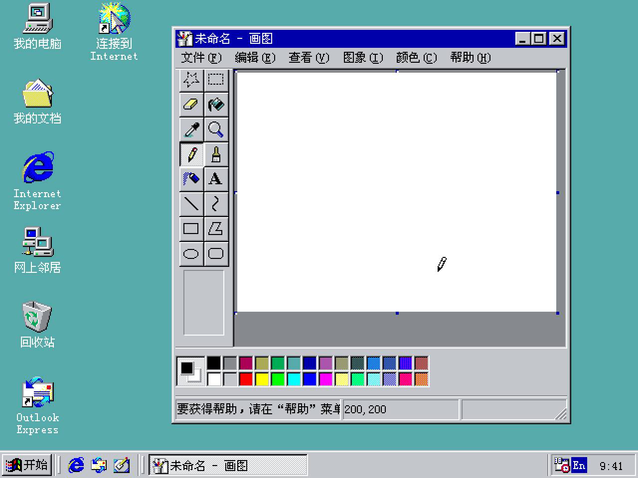
I grew up around the millennium as computers started to enter Chinese families. My first contact with computer is Windows 98 with its retro premature graphic interface, then the Windows XP with its glorious shiny 3D interface that blow my mind at first sight. That is the very first time that I was amazed by the design of a human interface.
A Vista type
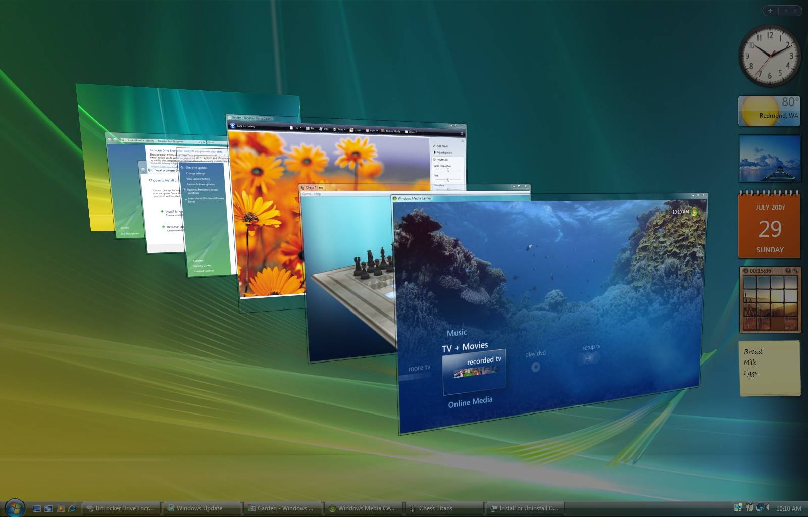
In 2007, I found the news that Microsoft released Windows Vista on the paper with several pictures. After that I was totally crazy with this new OS. I tried to find everything about it on the internet and install the so-called “Vista” theme on my XP device. However, what puzzled me is that however I tried to mimic the style of Vista with high-fidelity themes, I thought there were still something missing.
And that’s when I found the key factor – the type(face). Vista came with (at least) two brand new typefaces: Segoe and Microsoft YaHei. It was these two modern sans serif typefaces that changed the look and feel of Windows, like revolutionarily.
Since then, I came to know the concept of typefaces, and that was a seed for the future.
2009–2012
One million songs in my pocket
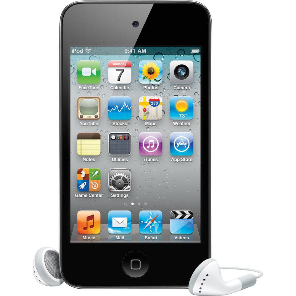
I got my first smart device — an iPod touch (4th gen) back in 2011. The experience was amazing and unparalleled. I was pretty impressed design-wise. The skeumorphism design and the crystal icons were part of my best memories at that time.
Every part of the iOS experience was enjoyable to me — the multi-touch gestures, gaming with gyroscope and the retina display enabling print-level font rendering (which I learned afterwards on Zhihu). And that’s when I started to wish I could create some design marvelous like this someday.
Metro that changed everything
Microsoft released Windows Phone 7 and Windows 8 in 2010 and 2012 with the company’s overhauled design language — Metro UI. This is the world’s first towards a flat design among tech companies. The language is inspired by the signages in city metro system.
It’s modern and clean, it’s fast and motion, and it’s about content and typography. For many years, I thought design and UI was mostly about graphic. But Metro meaned everything changed for me. It’s way beyond Vista ’cause it moved away from the shiny texture and shadows and embraced — the one and only — content, through typography.
2012–2015
Type is beautiful
The success of Metro inspired me to start my journey in design. I beginned to learn more about typography from almost everywhere. I started to care about the typography in city landscape, the signages, the commercials, literally everything.
And about that time I found Type is Beautiful on the internet, an independent project focusing on typography, design and society mainly through writing, publishing and podcasting. From Type is Beautiful and Zhihu, I learned a lot about typography and type design.
High school part-timer
I started to design something in high school as my knowledge base getting built gradually. I helped my class, football team and many school societies design the promotions — thanks to my friends’ trust on me. I was honestly not so good at drawing or painting so my workflow was mostly about type and typography — and the outcome was well-received. Bravo!
So besides the tense preparation for the NCEE, I lived as a happy design part-timer. I browse (Behance, Dribbble), I learn (typography, etc.) and I create.
“So Ryan, what are you gonna do in the future?”
A friend of mine from Germany asked me this question back in the summer of 2014. It was a late summer night and we sat by the coffee table in the lobby of the hotel. Honestly I haven’t thought about that too much before, but at that moment, I simply came up with the answer — “to be an independent creator that has my own app on the App Store”.
After many years, this memory still comes back to me. Do those words really reflect my heart? Yes, definitely.
2015–2019
Major setback
The result of NECC is basically satisfying but I wasn’t able to overcome the pressure from family and was after all forced to go to medical college of Fudan University. That’s how my college life started. There were times that I tried to compromise with it, but it turned out to be too painful for me to take the medical way.
The strong contrast between two carrers: the blood and flesh, and the delicate design, those were just too hard for me to make a tranformation and I was even depressed for several months.
Keep on designin’
Though it’s painful in my major. I tried to pick up my college life again through design. The visual environment in Fudan campus was kind of a mess back in 2015 and I hoped that I could make a difference.
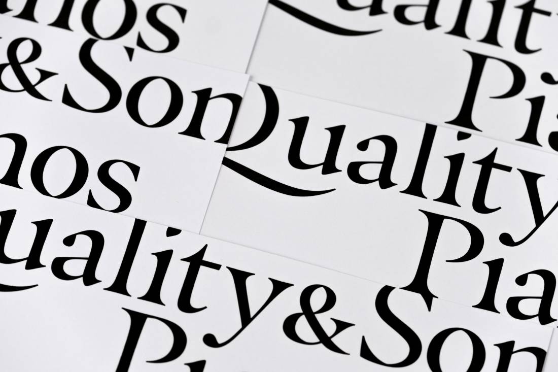
I found a bunch of people with the same vision and ambition, an independent student press called 99° Press. During the two years in the press, I designed many graphics and made my contribution to improve the knowledge on typography in the campus. This team and the memory is what I truly treasure and am proud of.
The decision
So I basically made up my mind to become a designer instead of a doctor back in 2016, my second year in college. I lived my life by spending most of my time in design while keeping my academic progress at an adequate level for graduation.
Reading and critics
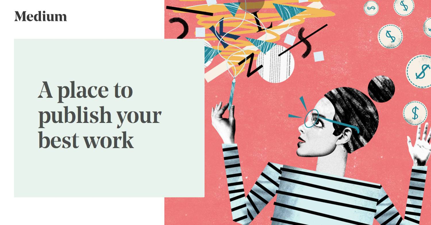
Besides the daily browsing among many design sites like Behance and Dribbble, I started my daily reading years ago, mainly on Medium. Medium used to be a site that was so popular among developers and designers that people shared their experience and thoughts on it. Those were the happy times and I learned quite a lot. Besides reading, I also wrote design critics, I wrote critics on the design of iOS 11 and Windows 10 on Medium and Zhihu and received over 30K upvotes on both platforms combined.
Podcast is a friend
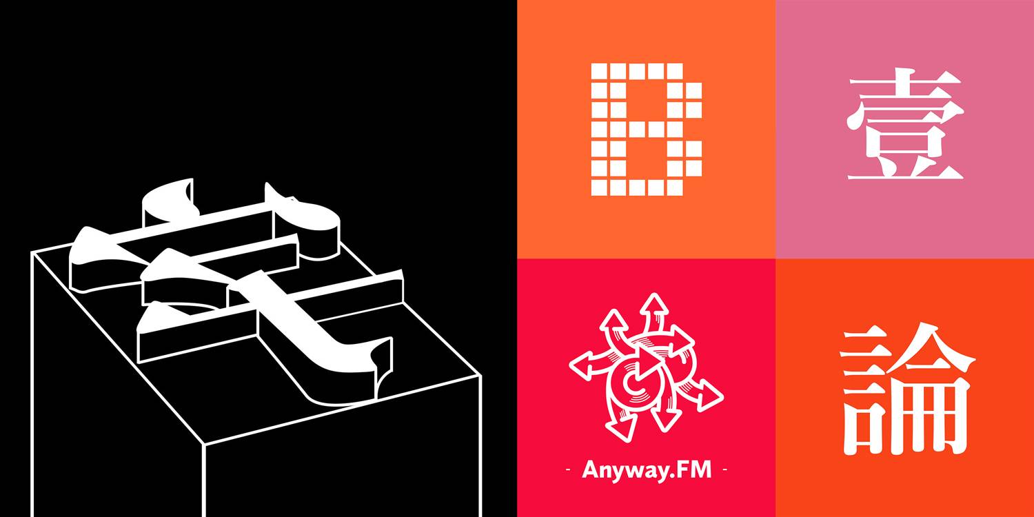
Podcasts went viral pretty quickly years ago in the small circle of independent online publishers, developers and designers. As a medical student, there was quite a lot of time spending on commuting between campus and hospital. So podcast became my best friend. I listened to many podcast like TypeChat 字谈字畅, Anyway.FM, Bitvoice 比特新声 and Yitianshijie 一天世界.
Get my hands on code
In 2017, I finally got my hands on code. I beginned my front-end development journey from W3CSchools, MDN, and online courses on Udemy. I spent almost every night until late midnight for two months on it. I learned the how-to of front end development and soon after that I had my first front-end project: 99° Press ’17 Graduation Checklist, a HTML5 web app tailored for WeChat experience. In 2018, I redesigned and developed the official website of 3type independently.
In 2018, I got on the basics of Swift language through the course Design+Code by Meng To. With that knowledge in mind, I developed Aksara, an app dedicted for learning various Indian scripts, which is now available for iPhone and iPad on App Store. By now, it seems that I kind of realised my goal of becoming an independent creator on App Store. But am I done? It’s just a beginning.
Joining 3type
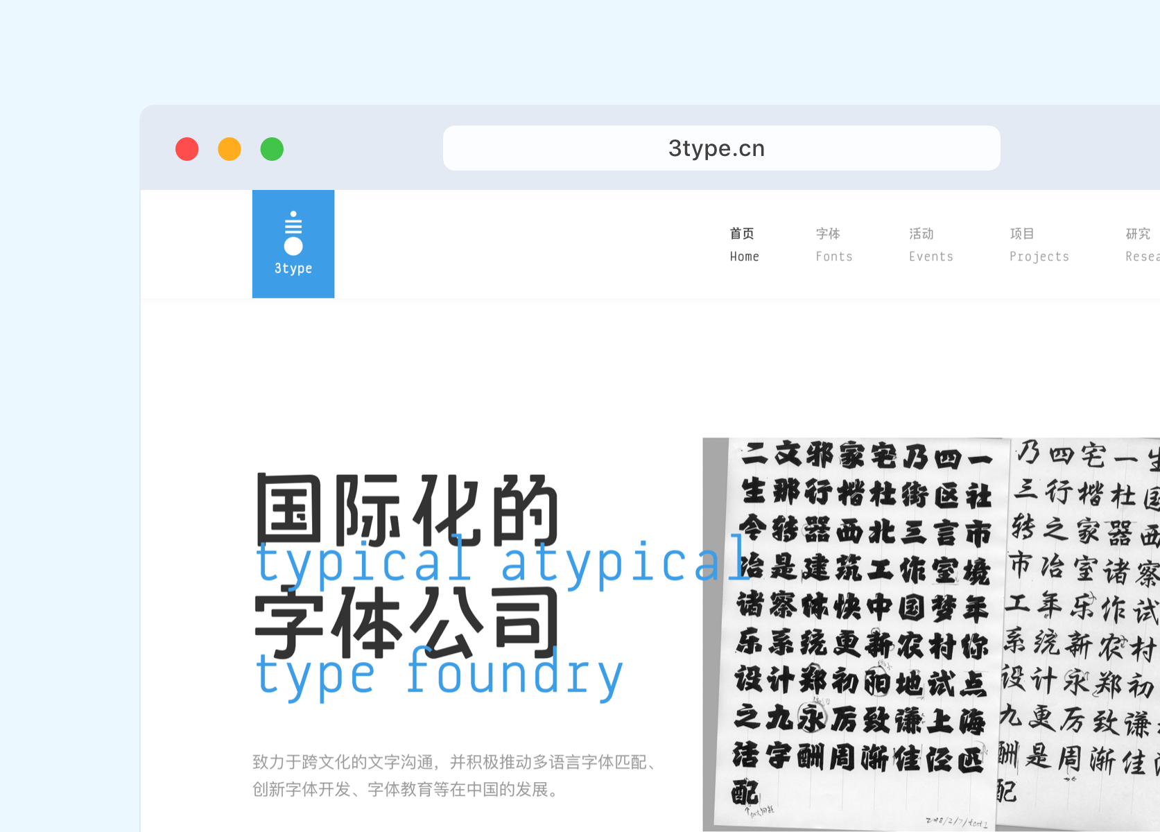
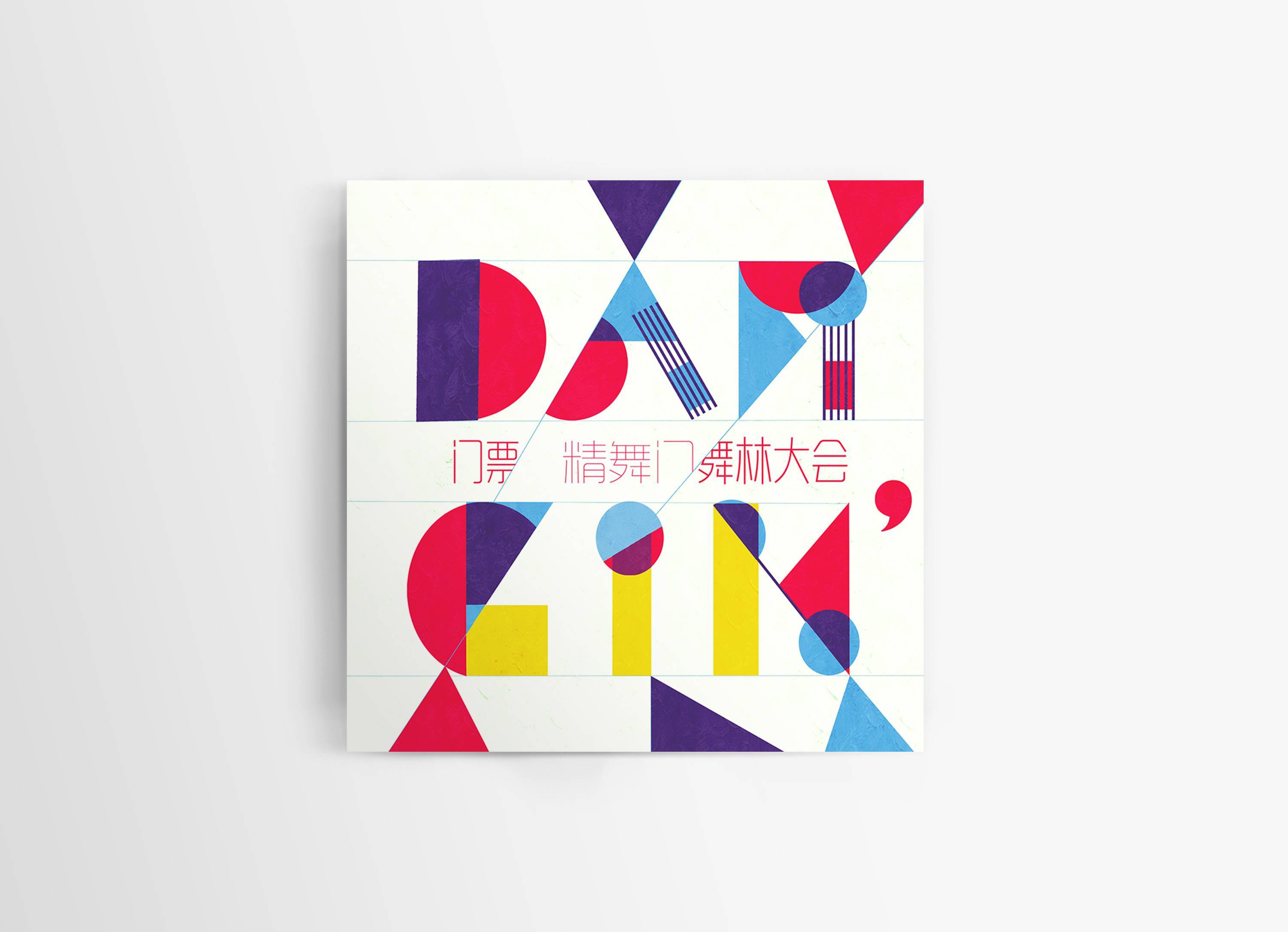
Though I’ve been a long time typography enthusiast, but to design typefaces is not really on my plan, until I met the friends of 3type. In summer 2017, I signed up for 3type’s TypeSchool in Shanghai and started my journey on type design. We soon became friends and I joined 3type to design typefaces and to be their developer. During these two years, I designed sereval typefaces for general customers and enterprises. Type design is really quite fun.
Designing human interfaces
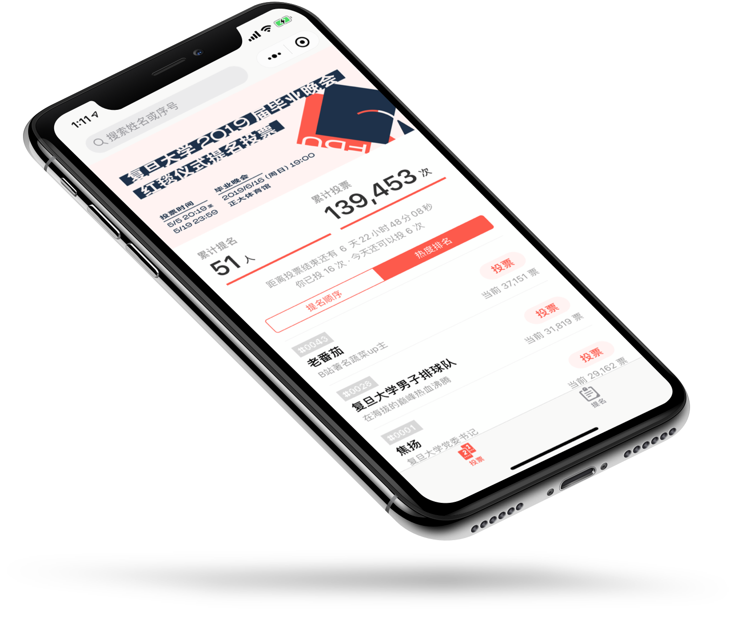
I beginned designing UI since college, mostly for freelance projects and competitions. There was a time I was really into Microsoft’s vision of Universal Windows Platform, so I designed Journo, a universal journal app for Windows 10. In 2016, I was in charge of the 2.0 version design revamp of Jutou app, though unfortunately the update was never made available. In 2018, I designed and developed the website of 3type, with responsive web design principles in mind. In 2019, I designed the WeChat mini app for Fudan Grad Night ’19 Red Carpet Vote. For all these years, I learned through those experiences and that is an amazing journey worth continuing.
I am a fan of UI as I tirelessly play around different apps trying to get a better sense of designing a product from these daily experiences. I regularly browse Behance and Dribbble for inspirations and so-called latest trends. I deep dive into many design sessions made by Apple and other companies. Literally, I scratch around the whole internet to learn about interfaces.
I really like the words “to design at the junction of technology and culture”. I believe that’s my purpose from the very beginning. It’s not just designing UI, it’s redefining how human interacts with technology.
To be continued.
This site is under https://ryanlau.design.
Last updated on Oct 27, 2019.
Last updated on Oct 27, 2019.