Sonnet Sans Font Family
Sonnet Sans is a bespoke brand typeface designed for Meican, a leading digital corporate catering platform based in China, during my tenure as type designer at 3type. Balancing simplicity and sophistication, the Sonnet Sans font family reflects Meican’s identity as a technology-driven service brand rather than a traditional food company.
The typeface consists of two styles—Sonnet Sans Display, a high-contrast, elegantly narrow design for headlines, and Sonnet Sans Text, a meticulously balanced style optimized for readability.
Developed to reinforce the unique brand identity of Meican and enhance multilingual typesetting, Sonnet Sans achieves visual harmony across bilingual applications following its in-house release, ensuring a seamless brand presence across both digital interfaces and branding materials.


Client Story
About Meican
Founded in 2011, Meican is China’s leading digital corporate catering platform, merging diverse cuisine options with robust digital infrastructure to optimize dining experiences and operational efficiency.
Built around three key values, Meican delivers all-encompassing catering solutions to businesses and organizations, serving over 1 million users every single day:
Professional. Ensuring high standards in food quality, safety, and data-driven management, delivering consistently reliable meals.
Innovative. Integrating cutting-edge technology with user-centric design to create comfortable, engaging, and future-ready dining spaces.
Bon appétit. Collaborating with varied international and local vendors to offer versatile menus that suit diverse tastes and dietary needs.
A showcase of Meican’s signature experience
Background
A commission unlike any other
In 2017, we at 3type, are commissioned by Meican us to design a custom brand typeface tailored to their identity, while helping save the licensing cost for a foundry typeface every single year.
At the time, it was highly uncommon for Chinese brands to invest in a bespoke Latin typeface alone, making this project both rare and ahead of its time. Unlike typical restaurant or food-related branding, Meican’s request was unconventional: as a technology-driven company, Meican sought a typographic identity that reflected professionalism and modernity while maintaining continuity with their existing visual style.
At the time, Meican used DIN—a German industrial-style typeface—which is rooted in the post-war design philosophy of neutrality, characterized by an absence of strong stylistic traits. This posed a unique challenge: how do we extend this neutrality while introducing a contemporary and professional touch, that evokes appetite at the same time?
DIN font across different applications
Inspiration & Ideation
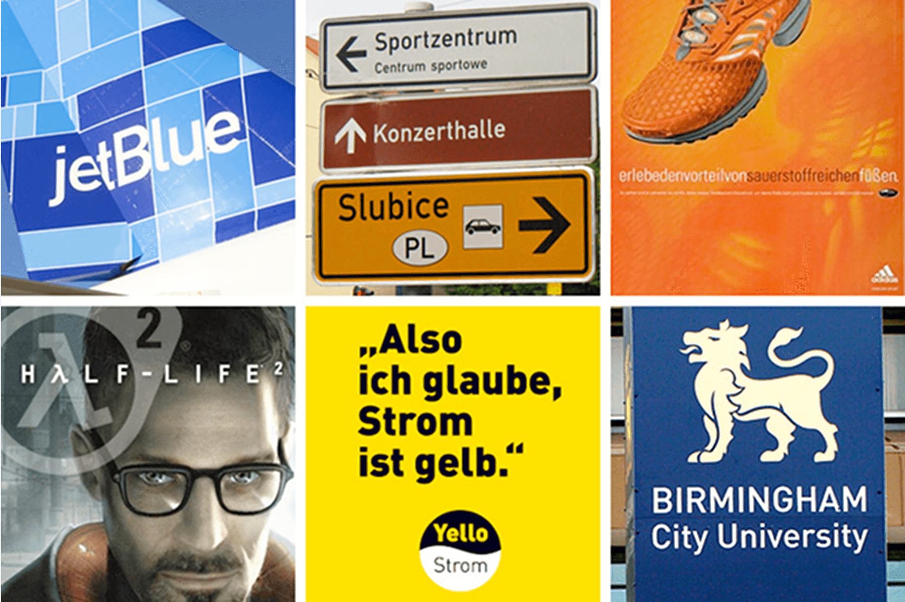
The common ground that embodies the industry
As we delved deeper into the food industry, we discovered a recurring typographic theme shared across different brands—whether local or international, traditional or modern. This slim, tall, and compact style of type consistently appeared in restaurant branding, packaging, and signage, serving as a visual shorthand for the industry’s distinct character.
Such vertical elegance not only conveys a sense of sophistication and refinement but also maximizes space efficiency, making it ideal for menus, storefronts, and digital applications. More than just aesthetics, this typographic choice reflects the identity of food culture itself—structured yet inviting, bold yet approachable—embodying the essence of dining experiences worldwide.
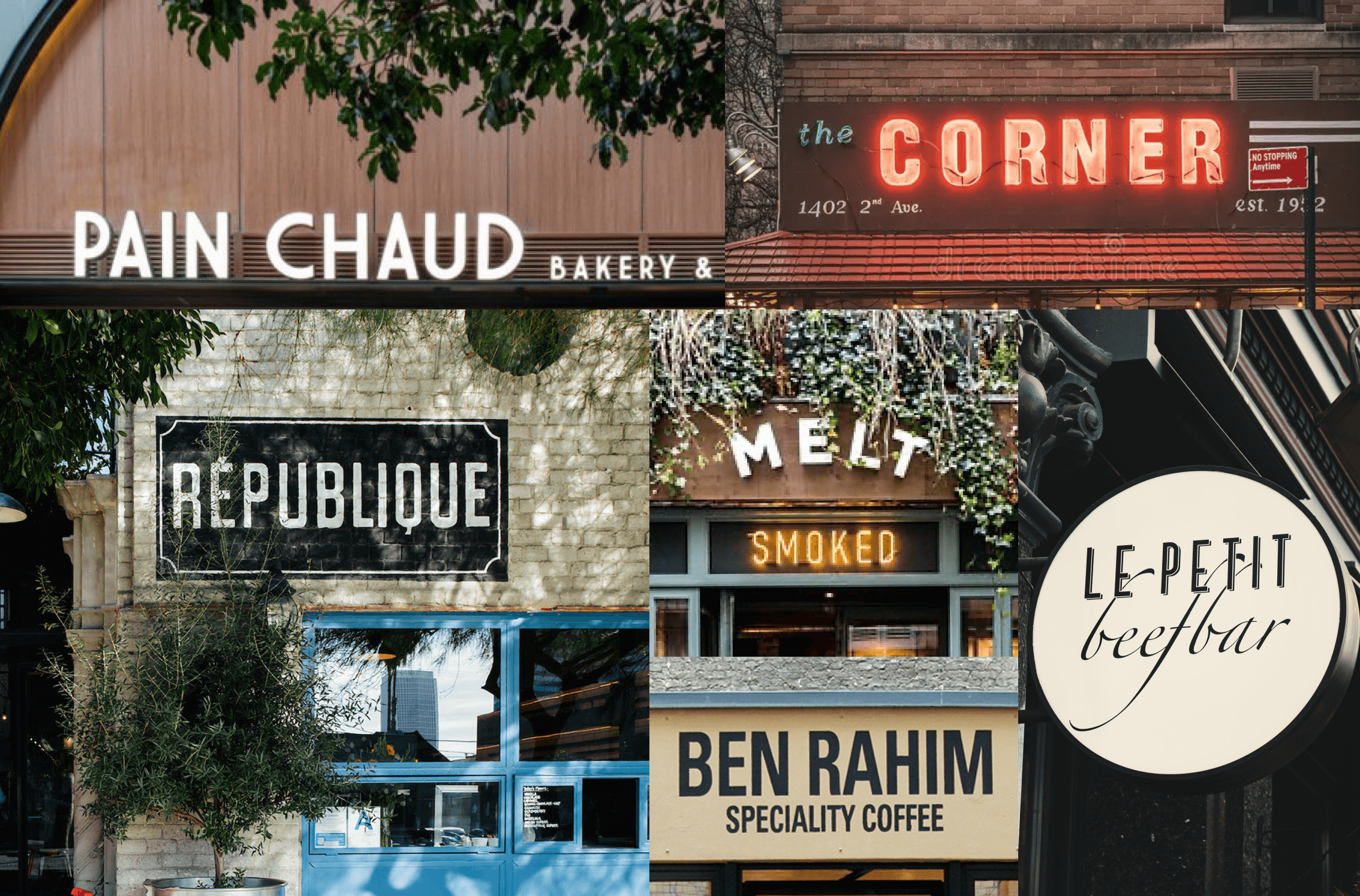
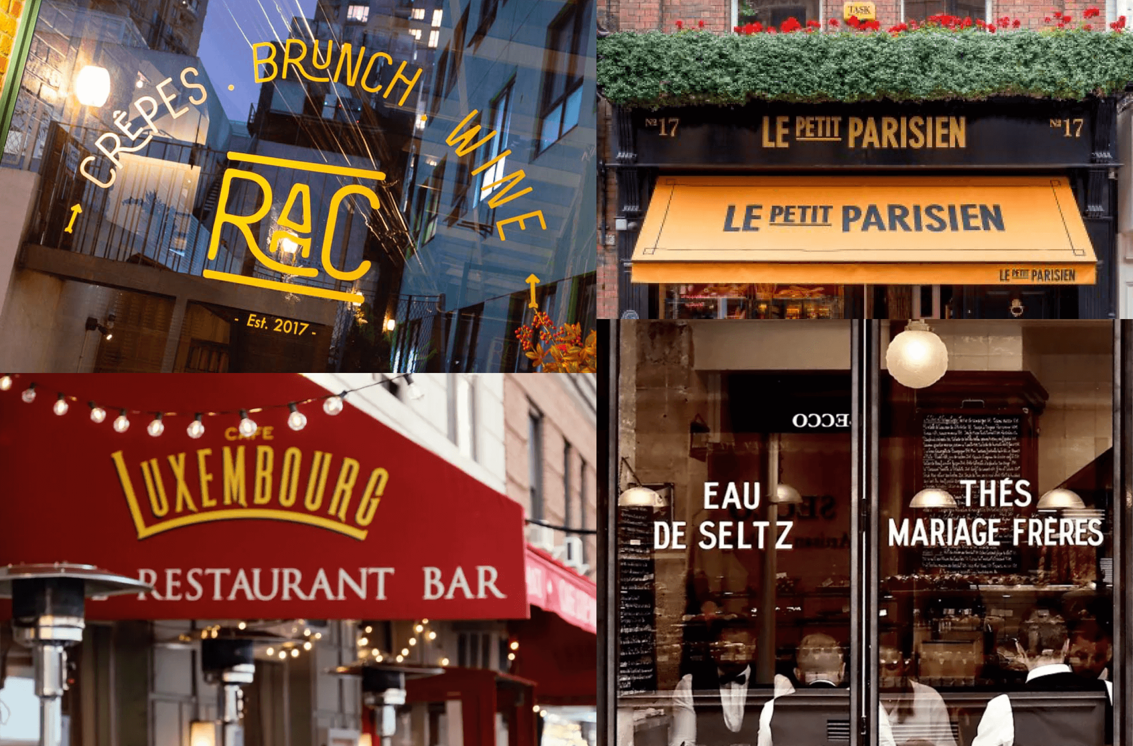
The same typographic style appears across restaurant signs worldwide
Proposal process
Four proposals,
four identities
As the frame and general directions of our design were set, we started with four initial proposals, each marking their own coordinate that interprets the nuanced personality of the design.
Proposal 1

Efficiency & Professionalism. Featuring a structured geometric skeleton, with horizontal or vertical terminal cuts that enhance precision and professionalism. Subtle curve variations add a touch of warmth without compromising clarity.
Proposal 2

Solid & Reliable. Incorporating slab serifs for a stronger, more grounded presence, adding a sense of sturdiness and reliability. The structure of the letterforms enhances legibility while reinforcing a confident, stable visual identity.
Proposal 3

Elegance & Ease. Increasing the contrast between uppercase and lowercase letters creates a more refined, natural flow. This design improves readability by enhancing letterform rhythm, while balanced curves and open counters add a sense of openness and comfort.
Proposal 4

Small Innovations, Big Impact. Instead of a rigid industrial approach, this design follows a more intuitive balance. The sharp angular cuts and geometric letterforms (e.g., the “t”) maintain crispness, while the open terminals introduce subtle humanist influences and warmth.
Finalizing the direction
Locating the optimal style
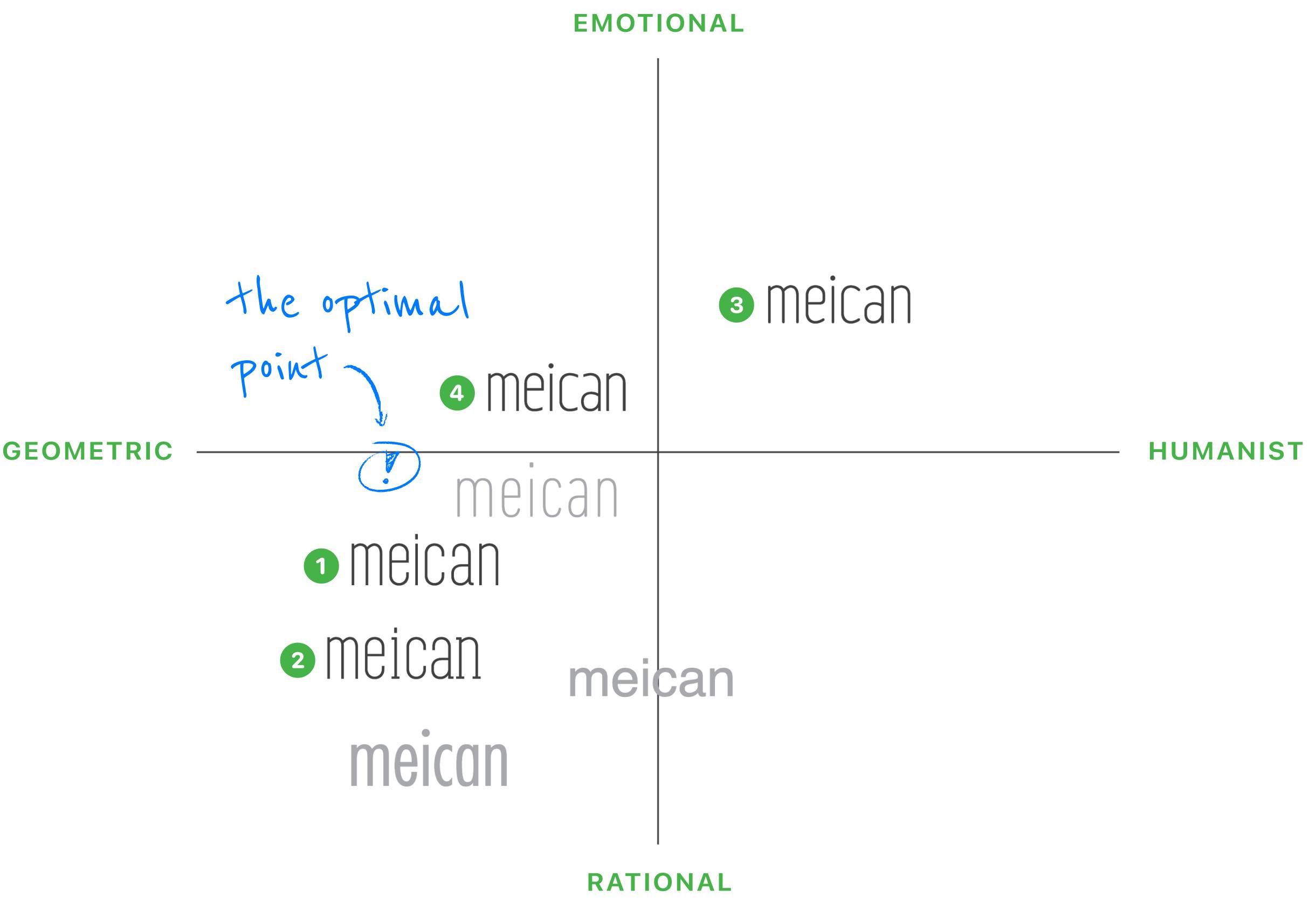
By mapping the four proposals alongside other foundry typefaces on the style axis, we, together with our client, gained a clearer understanding of how each approach aligned with the brand’s identity. This visual framework not only highlighted the unique characteristics of each design but also provided valuable insights into their resonance within the broader industry landscape.
Revisiting Meican’s three core values—professionalism, innovation, and the joy of dining (“bon appétit”)—and incorporating feedback from key decision-makers, we refined our direction.
Rather than selecting a single existing proposal, we strategically positioned the final design along the axis to strike a balance between geometric precision and brand expression, finding a middle ground between Proposal 1 and Proposal 4.
This approach ensures a typographic identity that conveys professionalism, clarity, and a welcoming brand presence—capturing both structure and emotion in a way that feels distinctly Meican.
Crafted with love and pride
Introducing Sonnet Sans Display


Sonnet Sans Display is our answer, crafted with love and pride.
The name draws inspiration from a simple yet profound idea: the harmony between structure and emotion, much like a sonnet—a poetic form defined by precision yet full of rhythm and warmth.
Similarly, Sonnet Sans Display was designed with a precise geometric foundation, ensuring clarity and professionalism, while subtle curves and open counters introduce a humanist warmth and fluidity.
The mention of “Display” reflects our vision for this typeface—a design that is meant to stand out boldly at large sizes, making a confident, impactful statement in headlines and branding.
At its core, Sonnet Sans Display embodies Meican’s dual nature—structured and efficient, yet human and inviting. Its geometric framework ensures clarity and reliability, much like Meican’s seamless digital solutions, while its soft curves and open counters bring a sense of warmth, reflecting the company’s commitment to an enjoyable and thoughtful dining experience.
Thus, Sonnet Sans Display was born—a typeface that, like poetry, carries meaning not just in its form, but in the way it makes people feel. Every word it shapes is clear, confident, and distinctly Meican.
At a glance
Simplicity sans rigidity
Sonnet Sans Display is built on a foundation of geometric simplicity, where clarity and precision define its core structure. The typeface features clean, well-balanced proportions, ensuring a seamless and efficient reading experience. Its straight-cut terminals and consistent stroke widths reinforce a sense of stability, while its precisely engineered geometric forms give it a modern, refined character.

Straight & clean lines introduce geometric simplicity
Despite its structural discipline, Sonnet Sans Display avoids rigidity. Subtle variations of stroke endings, metrics and curves introduce a natural flow, softening the otherwise sharp geometry to create a typeface that is both functional and inviting. This balance between order and warmth makes Sonnet Sans Display a versatile choice, suitable for both professional and expressive brand identities.

Variations in stroke endings for a touch of playfulness and warmth

Sonnet Sans Display brings a more dynamic rhythm compared to DIN
Font weights
Multiple weights, variable tone
Sonnet Sans Display offers eight carefully calibrated weights, providing a full spectrum of typographic expression—from the delicate precision of Hairline to the commanding presence of Black. Each weight is meticulously designed to maintain structural clarity and visual balance, ensuring consistency across headings, body text, and branding applications. Whether you need a light touch for elegance or a stronger voice for impact, Sonnet Sans Display adapts effortlessly to diverse design needs.
Beyond mere variation in thickness, each weight is fine-tuned to preserve legibility, rhythm, and proportion, making it a reliable choice for both digital and print environments. The seamless gradation between weights allows for versatile hierarchy building, empowering designers to create harmonious layouts with dynamic contrast—all within a single type family.
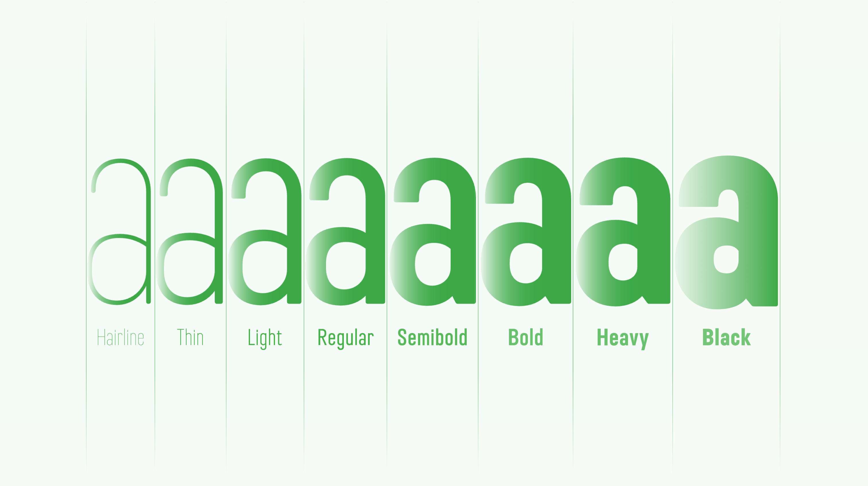
Variable font weight unlocks a multitude of possibilities
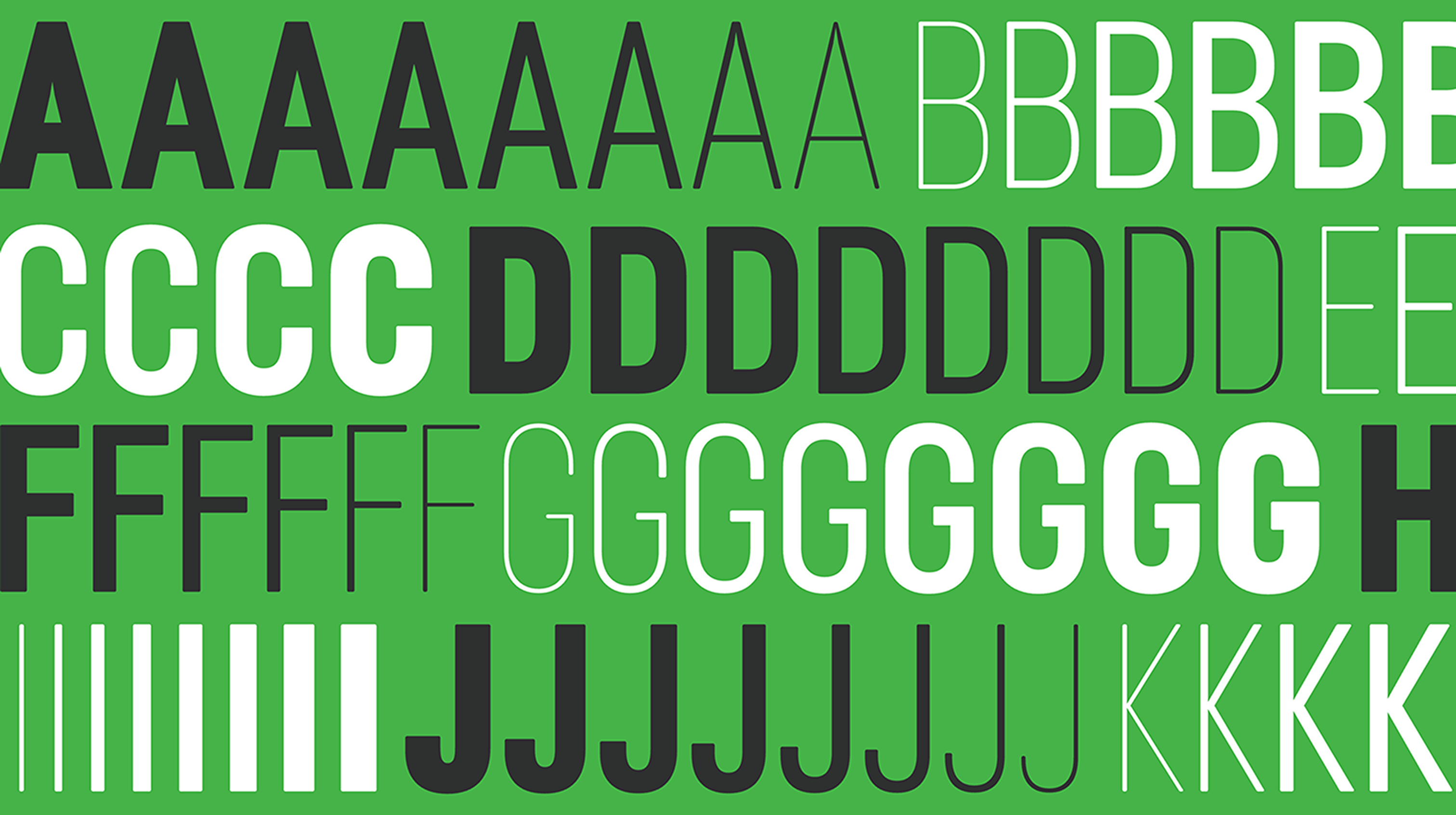
Stylistic alternatives
The type of your choice, truly

Sonnet Sans Display offers two distinct sets of stylistic alternatives, allowing for greater design flexibility.
One set amplifies geometric design, featuring straighter lines and minimalist letterforms for a clean, modern aesthetic.
The other takes inspiration from classic humanist designs, blending warmth and tradition with the contemporary essence of Sonnet Sans Display.
With these options at hand, choosing the perfect typographic expression has never been easier.
OpenType features
Fine-tuned for versatility
Sonnet Sans Display comes with a comprehensive set of OpenType features, offering greater control and flexibility in typography. Designed to enhance both functionality and aesthetics, these features allow for seamless, well-balanced text composition across different design contexts.
From standard ligatures and built-in fractions to tabular numbers and case-sensitive forms, every detail is crafted to refine typographic rhythm and visual harmony, making Sonnet Sans Display a reliable choice across various design applications.
Ligatures

Ligatures refine letter spacing and flow, preventing collisions and enhancing readability, making text appear more refined.
Built-in fractions

Automatically formatted fractions ensure precision, making measurements and technical data easier to read.
Tabular figures

Numbers are in this way set at uniform widths, ensuring perfect alignment in tables and menus for effortless comparison.
Case-sensitive forms

Punctuation and symbols automatically adjust to uppercase letters, keeping timestamps and headlines visually balanced.
Expansive character set
Multilingual-ready from day one

Sonnet Sans Display features a comprehensive character set, covering most European languages that use the Latin script. It ensures that diacritics, accents, and special characters—commonly found in food names and culinary culture—are rendered properly.
Beyond basic coverage, Sonnet Sans includes language-specific features, such as contextual alternates and localized forms. Whether for French diacritics, or German sharp S, every detail is fine-tuned to improve readability while preserving the typeface’s distinctive aesthetics.
Designed for readability
Sonnet Sans Text

While the high, tall design of Sonnet Sans creates a striking and modern aesthetic, we found that it wasn’t always ideal for extended reading or small font sizes. To address this, we turned to the time-honored principles of optical sizing from traditional typesetting—where text fonts were carefully adjusted for clarity and comfort at smaller sizes.
Thus, we crafted Sonnet Sans Text, a typeface specially optimized for long-form reading and smaller applications while preserving the signature characteristics of the Sonnet Sans family.
Adjustments such as slightly wider proportions, and improved spacing ensure better legibility without sacrificing the distinct identity of the Sonnet Sans family. The result is a typeface that retains the elegance and precision of its display counterpart while offering a more reader-friendly experience across print and digital formats.
Multilingual optimization
Tailored for harmonious Chinese typesetting

Sonnet Sans Text is specifically crafted for harmonious Latin and Chinese typesetting, ensuring a balanced visual rhythm when the two scripts appear together. Its proportions, stroke weight, and spacing have been carefully adjusted to complement the structure and density of Chinese characters, avoiding imbalances in texture and readability.
With these refinements, Sonnet Sans Text enhances readability and cohesion in multilingual layouts, making it a natural choice for branding, publishing, and UI design where Latin and Chinese text coexist.
Real-world applications
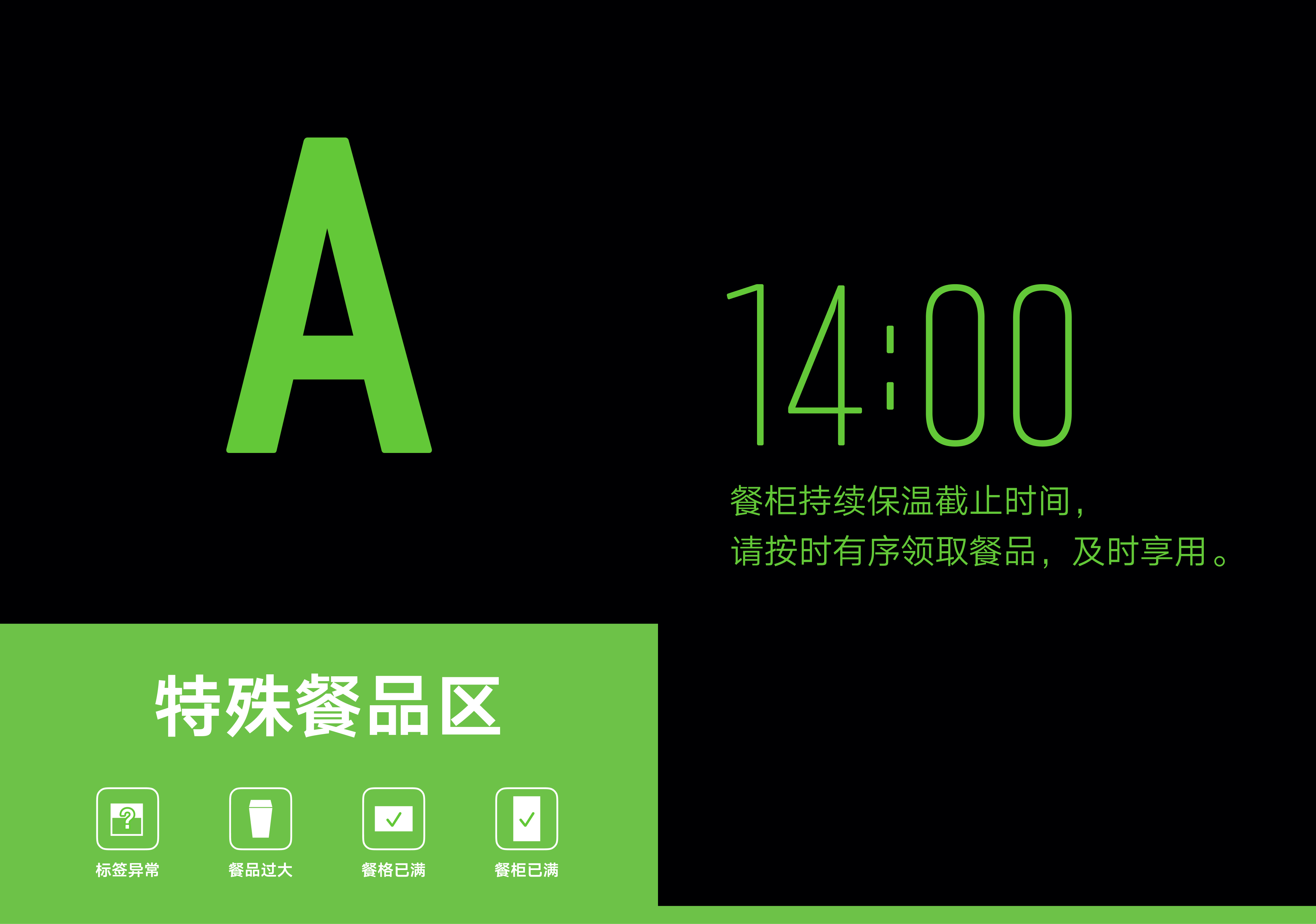
See Sonnet Sans in action
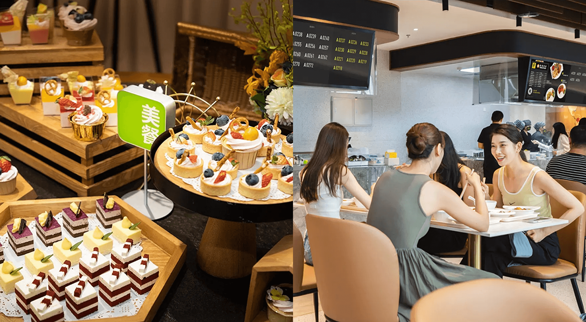
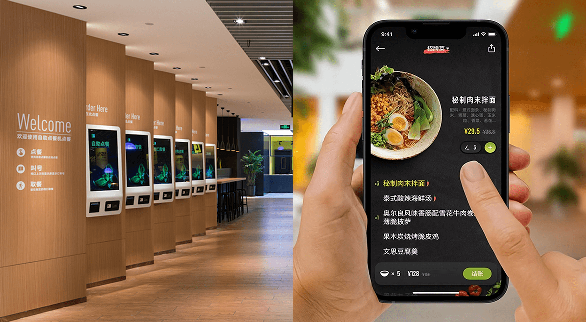
Following Sonnet Sans’ in-house release in 2019, Meican gradually adopted Sonnet Sans across various brand touchpoints, including employee badges, meal cards, posters, and its app interface. The typeface seamlessly integrates into Meican’s ecosystem, reinforcing its professional and modern brand identity in both digital and physical environments.
Now experience Sonnet Sans in real-world applications and witness how it enhances and elevates Meican’s branding.
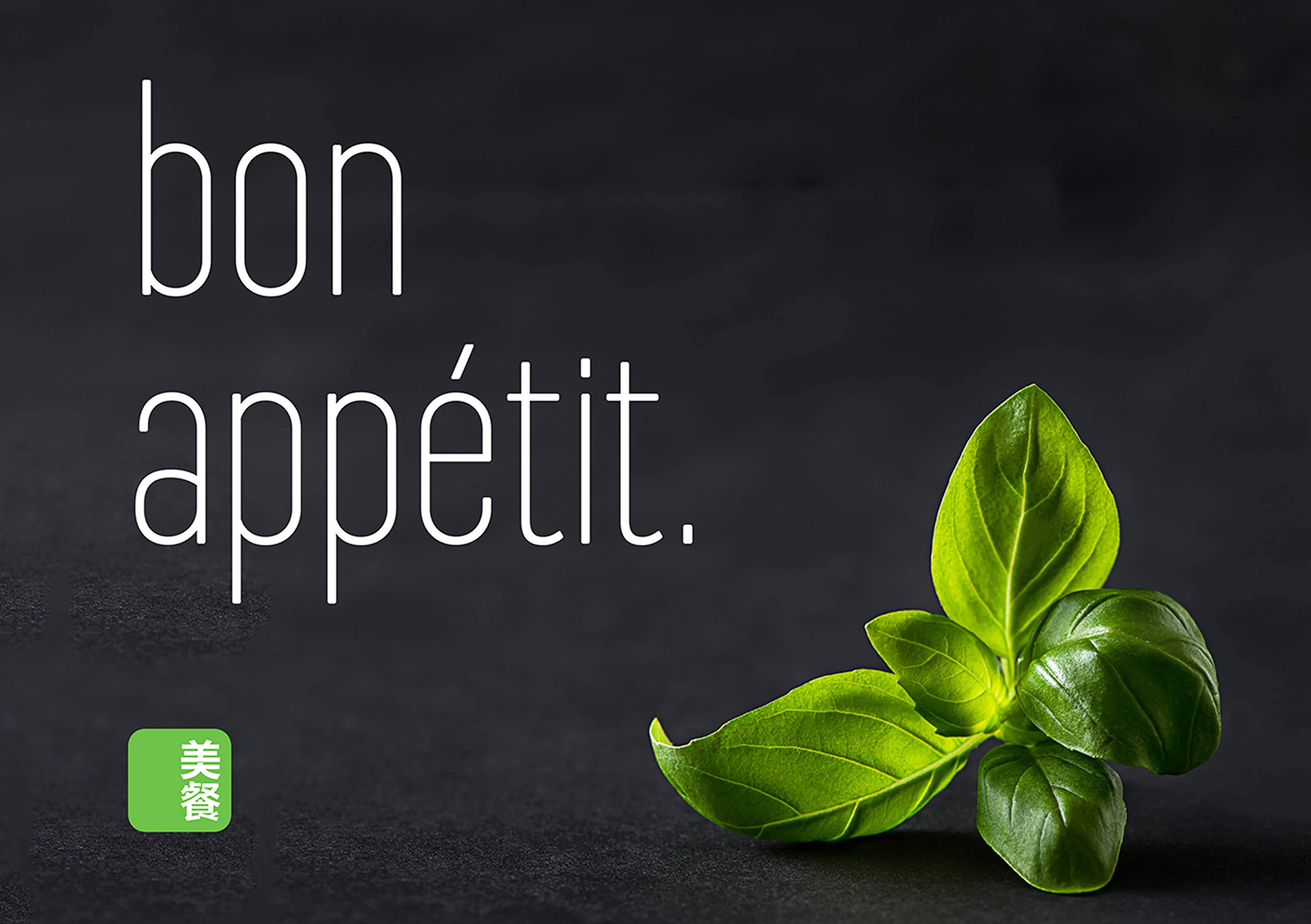

Branding graphics with Sonnet Sans Display & Text


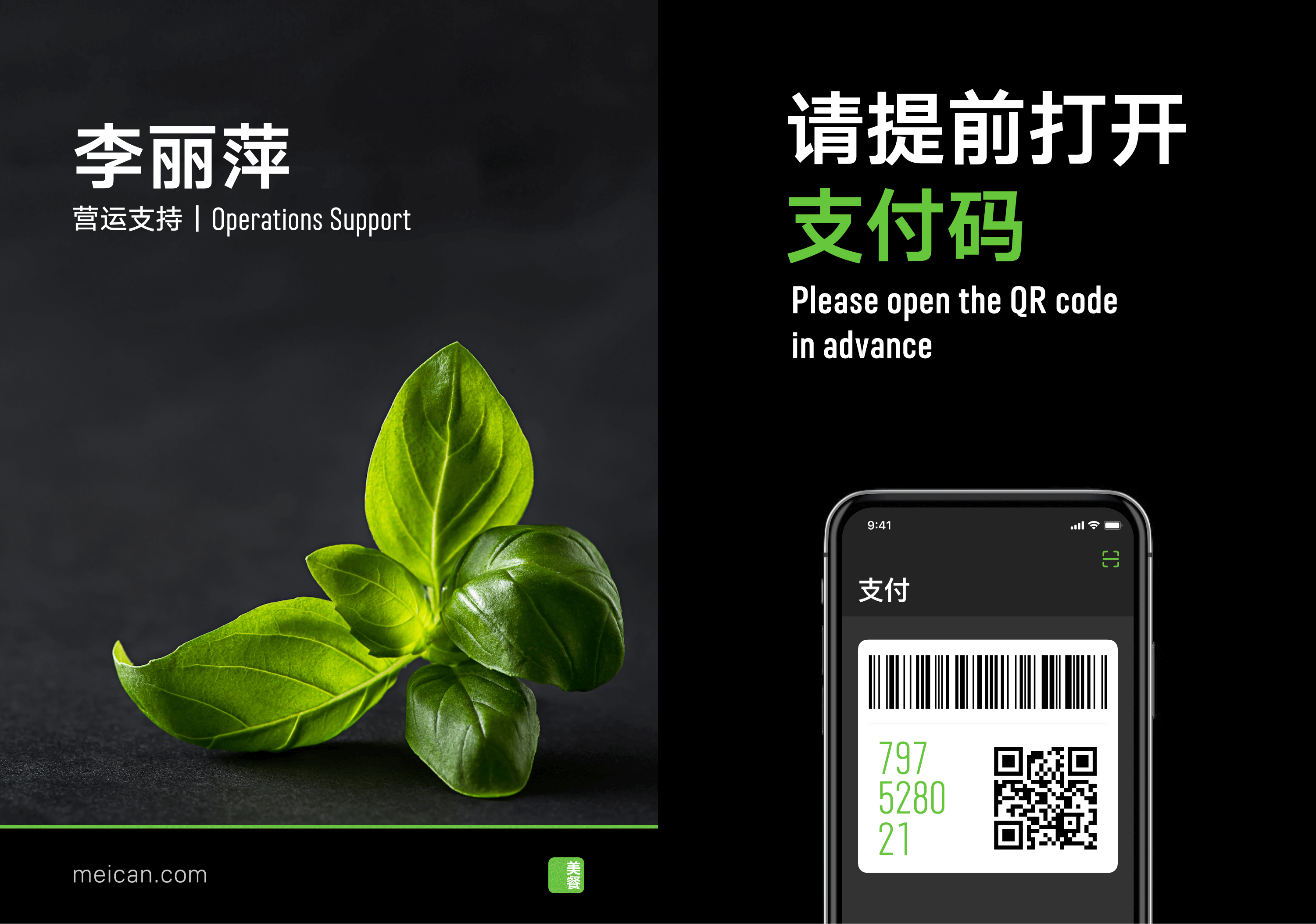
A seamless brand presence spanning digital and print