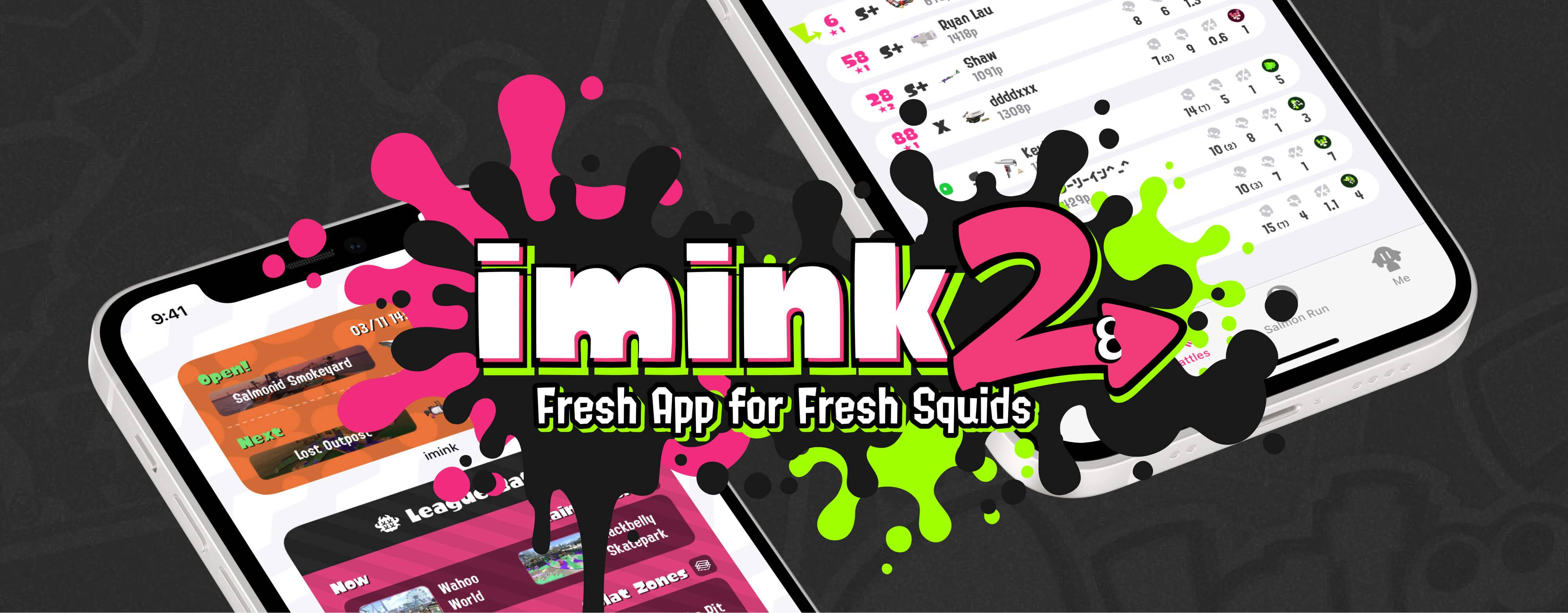
imink for Splatoon 2
imink is a free third-party game companion app on the App Store, created from zero by a four-member team, dedicated for the Nintendo Switch game title Splatoon 2.
As a founding member of the team, my responsibilities covers a multitude, including UX design, type design, localization, and digital marketing.
Targeted at a global audience, the app received, within one year after the release, more than 35,000 downloads globally, and a rating of 4.4 out of 5 on the App Store, with over 60% of users from international markets.
We’ve also written a little piece on GCORES 机核, the leading gaming site in China which covers a broader scope of gaming culture, through which you could take a closer glimpse on how this app was built, and reflected the reception we’ve received in the local gaming community.
Background
How our saga started
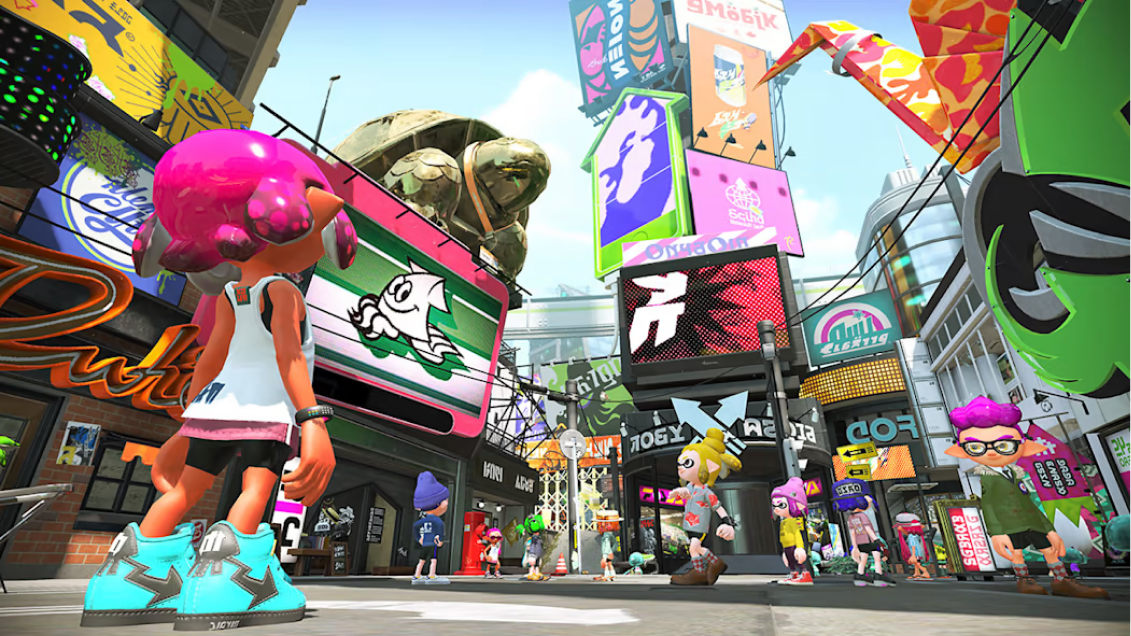
Back to myself, years ago, I never really self proclaimed as a gamer. The first time I purchased a Nintendo Switch, that was for explore the interaction mechanism in the famous Legend of Zelda: Breath of the Wild. However, while I scrolled randomly through the eShop, a cover art featuring an unusual color combination popped up in my view, that’s how I met the Splatoon franchise.
This soon became a never-ending story. Besides the game mechanism, it's the vibrant community that makes this franchise really shines. Through this experience, I had my life crossed with new friends, with whom we carried through the most difficult time during the pandemic. And particularly, because of the creative and unique design of Splatoon, there's a greater share of designers and creatives among its audience. That is to say, I met new friends that shared the interests that were just quite alike as mine.
Splatoon 2 came with an official mobile game companion, SplatNet 2, as child section under the app Nintendo Switch Online. It works, most of the time. But its web-based nature has brought a great bunch of restrictions and incapabilities, whether for the newcomers or hard-core enthusiasts. Therefore me and my pals started a project to build a native iOS app that was to be built by the gamers, and for the gamers.
The worldview of Splatoon 2
SplatNet 2
The official app: an anatomy
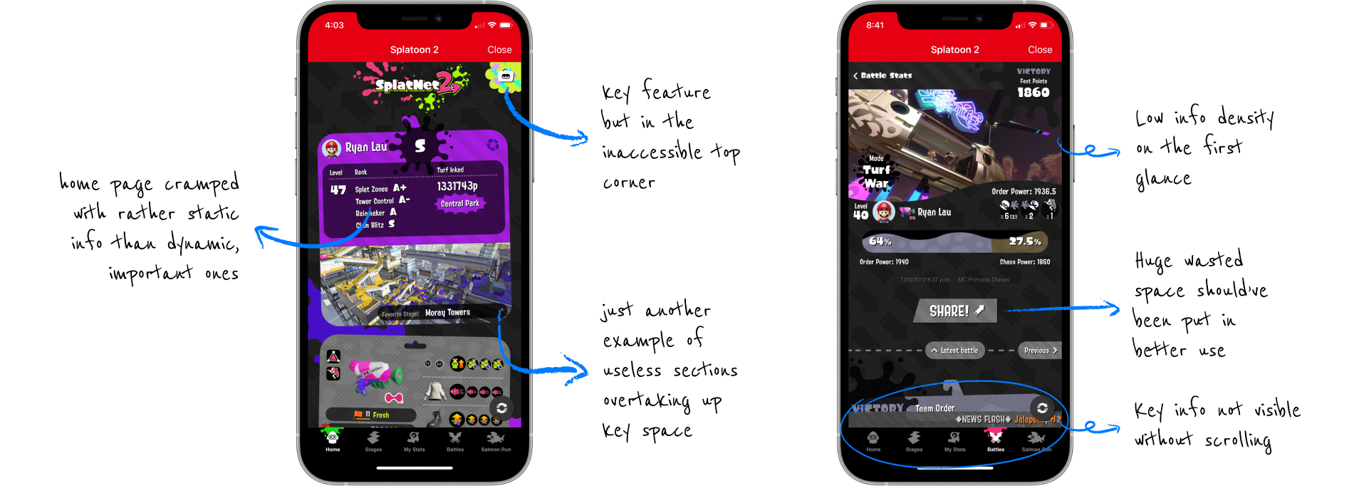
If we were to lay it all out, SplatNet 2, which is the official companion app made by Nintendo, was never entirely a disappointment. For many players, it provided the fundamental tools needed to stay connected to their in-game progress—browsing current rotations, checking battle results, all in one place, at their fingertips, ensuring they didn’t have to boot up the console every time they wanted a quick status check.
Yet, as we delved deeper, SplatNet 2 was somewhat limited in its flexibility. Its web-based core meant slow load times and a less-than-fluid interface experience, which often left players feeling disconnected rather than engaged. Navigating menus sometimes felt counterintuitive, and the app never quite harnessed the full potential of iOS.
Besides, there was its lack of a Chinese language interface. For native Chinese-speaking players—many of whom form a vibrant corner of the global Splatoon community—this language barrier meant a less welcoming experience.
Over time, these limitations sparked the desire for something more—an app built for a global audience, ultimately providing a more seamless, welcoming experience that truly feels like part of the Apple ecosystem, and extends the world of Inkopolis beyond the game console.
Getting hands on
Laying out the targets
- A streamlined and intuitive UX with a refined information structure tailored to the needs of gamers
- A fresh aesthetic blending the Splatoon art direction with the iOS design language in harmony
- Utilization of latest technologies and iOS capabilities, including SwiftUI and Home Screen widgets
- A top-notch Chinese localization without any compromise on both clarity and style
- A set of custom Chinese typefaces that are well in line with its Japanese and English counterparts
- Regional marketing materials in 6 languages, to better connect with an international user base
How we work
The collaboration model
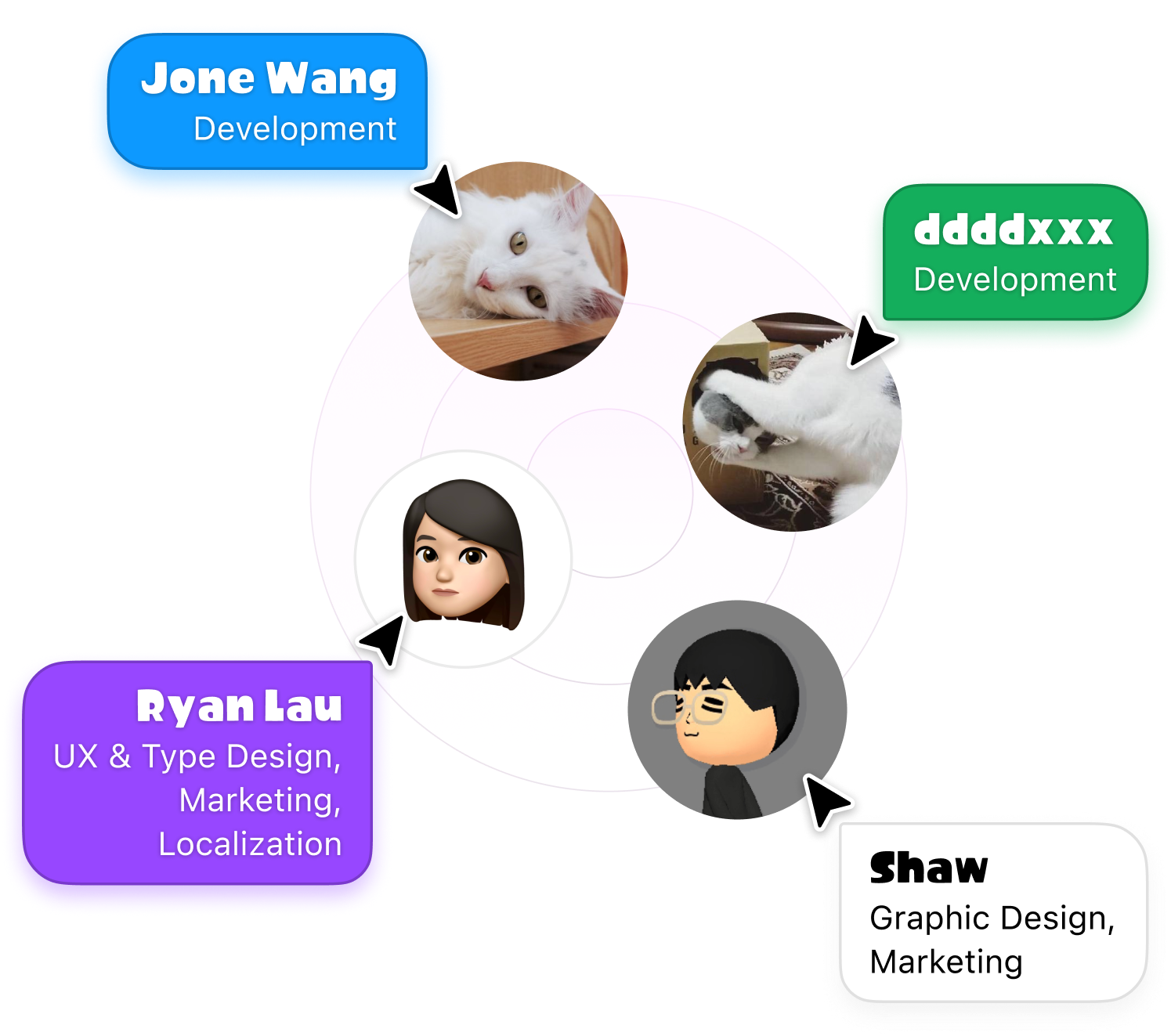
As a compact core team of four, featuring two developers and two designers, we shared a unified vision of delivering the best possible user experience and ensuring uncompromising app quality.
Rather than rigidly separating our roles, the developers often advised on the best practices to harness iOS capabilities, which in turn influenced design decisions. Meanwhile, we designers didn’t hesitate to step into code reviews, ensuring that the final implementation remained true to our creative vision.
Personally, my own multidisciplinary background allows me to move across different tasks including copywriting, social media campaigns, or localization coordination.
From scratch to reality
The promise as we delivered
From the moment the idea took shape in October 2020, we set our sights on an ambitious goal: to bring this app to a worldwide audience. By March 2021—just a few short months later—we made good on that promise, launching imink on the App Store across the globe. Within the first three days of its release, we saw over 1,100 downloads in Mainland China and Taiwan alone, and more than 1,500 overall.
Fast forward to imink’s first anniversary, and those numbers spoke volumes about our impact: more than 35,000 total downloads, a 4.4 out of 5 rating on the App Store, and over 60% of our user base hailing from international markets. This global reach was testament to our team’s dedication, as well as the vibrant Splatoon community we set out to serve.


At a glance
Everything in a compact fingerprint
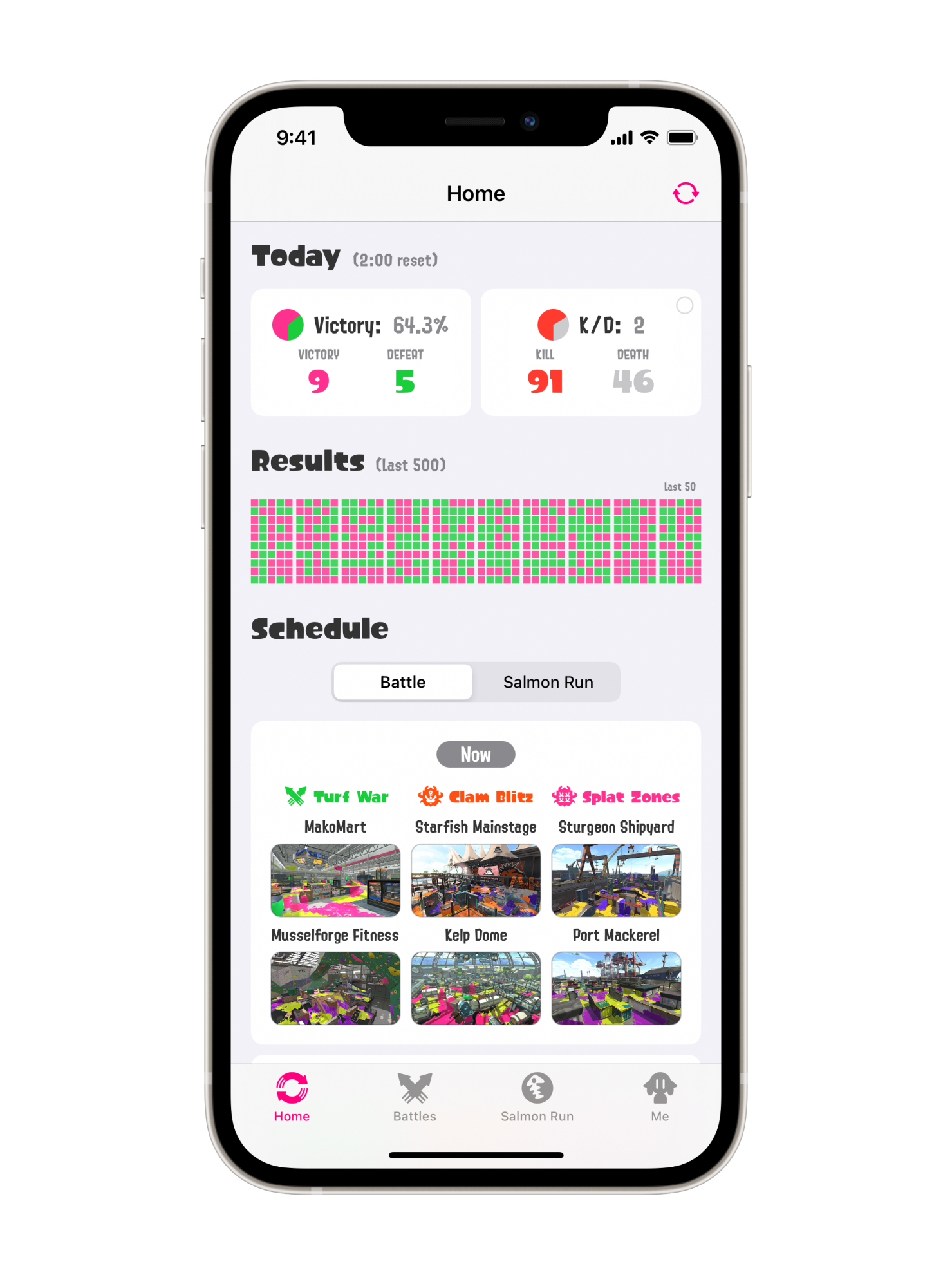
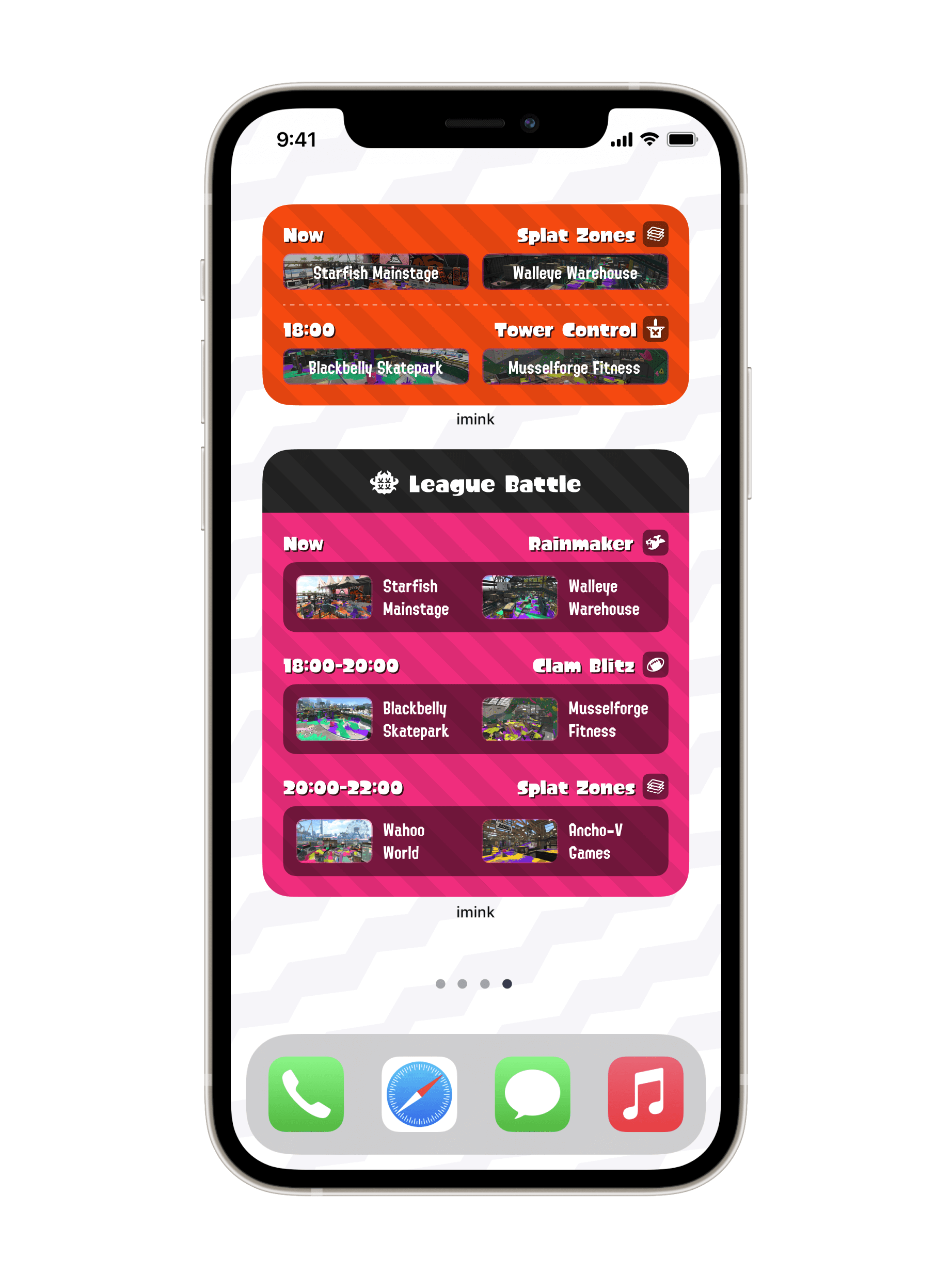
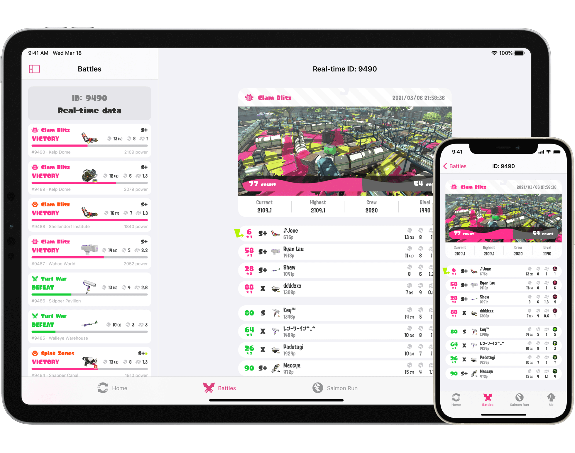
Minimized fingerprintDeveloped entirely with SwiftUI, imink launched on the App Store at just 23 MB, yet it covers all the essential features Splatoon 2 players rely on.
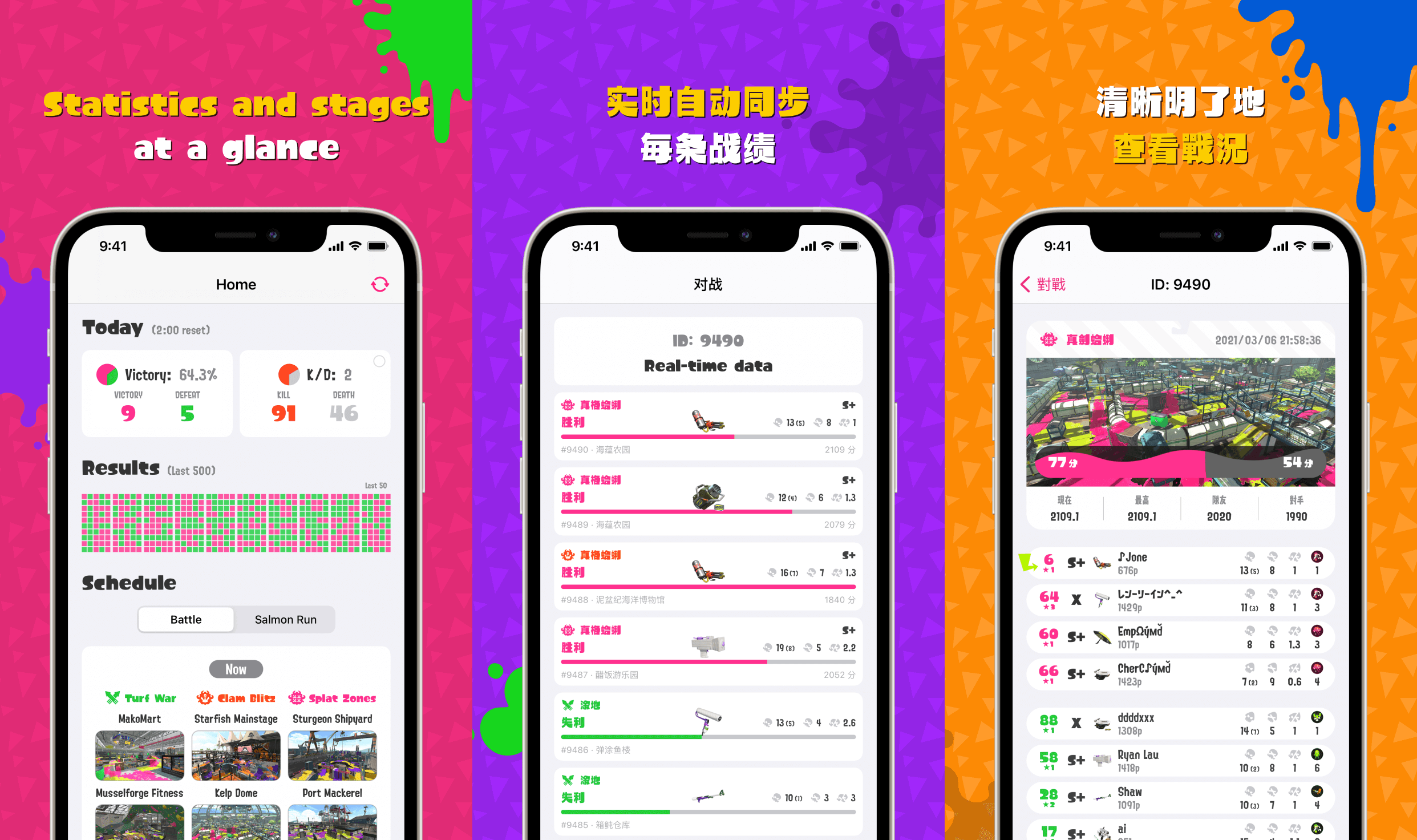
Right at homeOn the home screen, beyond the standard 24-hour stage schedule, you’ll see daily statistics like your win rate and kills prominently displayed at the top. There’s also a chart showcasing the outcomes of your last 500 matches. According to the developers, more data insights will be added here in the future. Since this is the first page you’ll see when opening the app, the team wanted the homepage to break free from the “just check the schedule” routine and serve as an overview hub for your day-to-day gaming experience.
The complete experienceThree additional tabs—“Battle,” “Salmon Run,” and “Me”—complete imink’s core feature set. Together, these four tabs offer everything players need for a streamlined, intuitive companion to their Splatoon 2 gameplay.
From console to fingertips
Simply intuitive and hassle-free
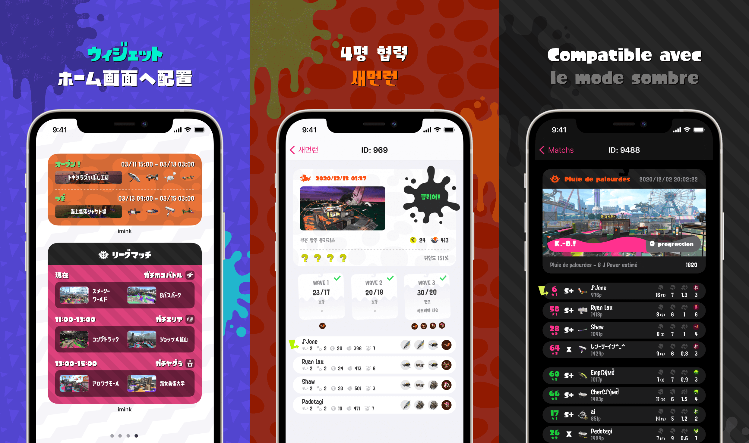
Enjoy your game without interruptions as every battle result will be automatically synced in no time and stored to local storage with no upper limit.
The redesigned battle list puts all key informations in a unified, clean and compact table design that is ultra-compatible with any game mode.
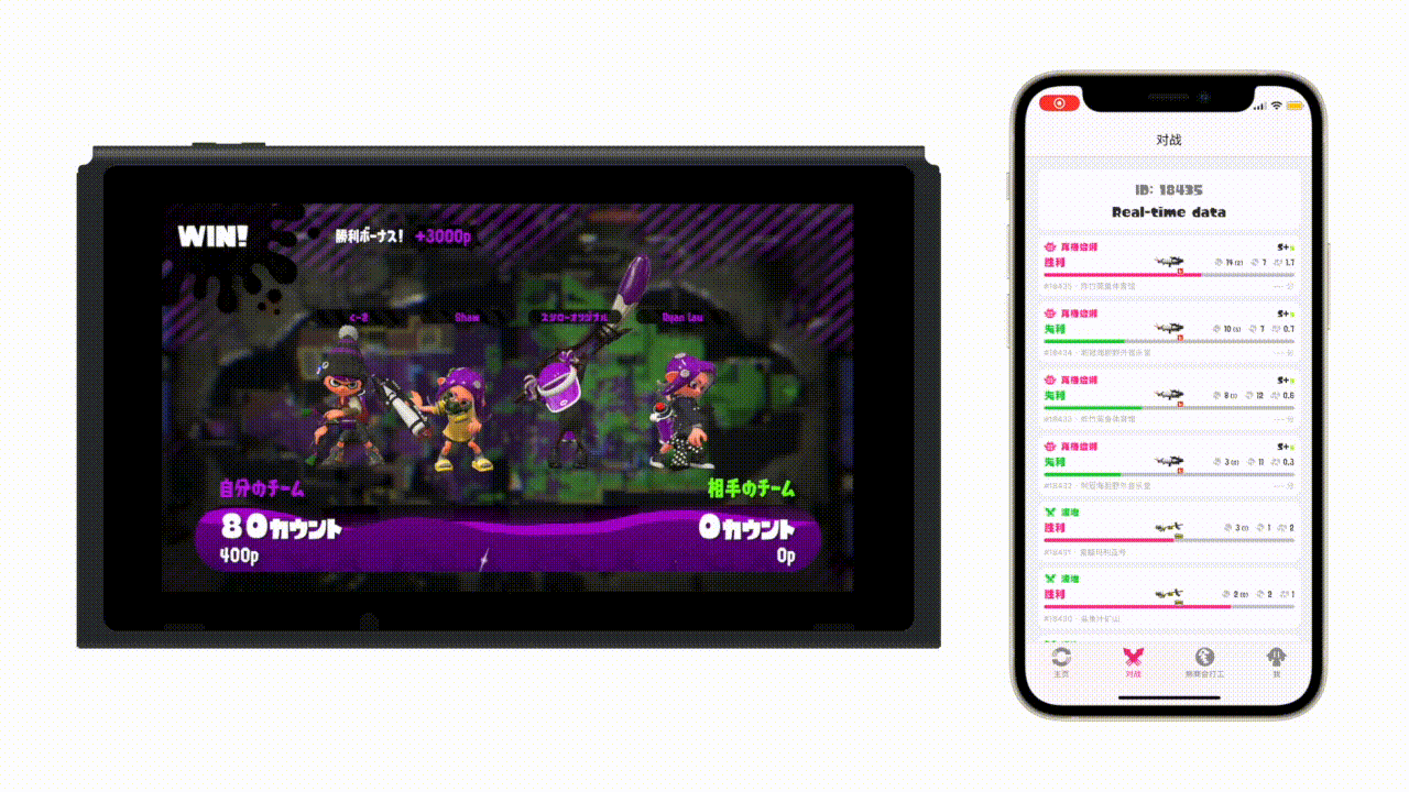
Latest result gets pushed to the device once a battle is over
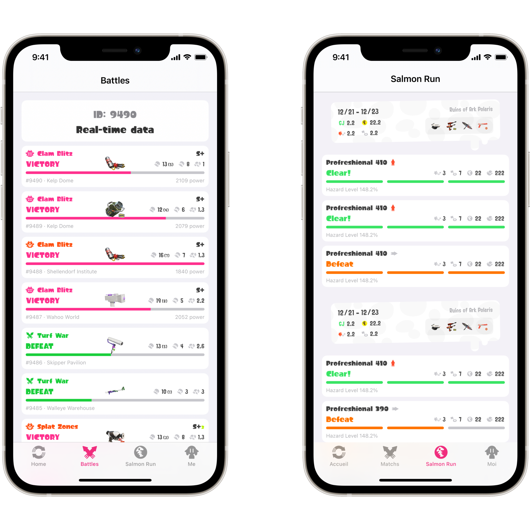
A unified list design that suits both PVP and PVE modes
Battle insights
Handy at every level
The reimagined battle result page provides a streamlined experience of viewing results from battles.
Existing companion apps often neglect single-screen usability, making it impossible for players to share their matches with every crucial detail fit into one single screenshot. By analyzing the information hierarchy of each piece of data according to the needs of gamers, we redesigned the layout so that everything you need to see fits neatly on a single screen, what it works beautifully for any game mode.
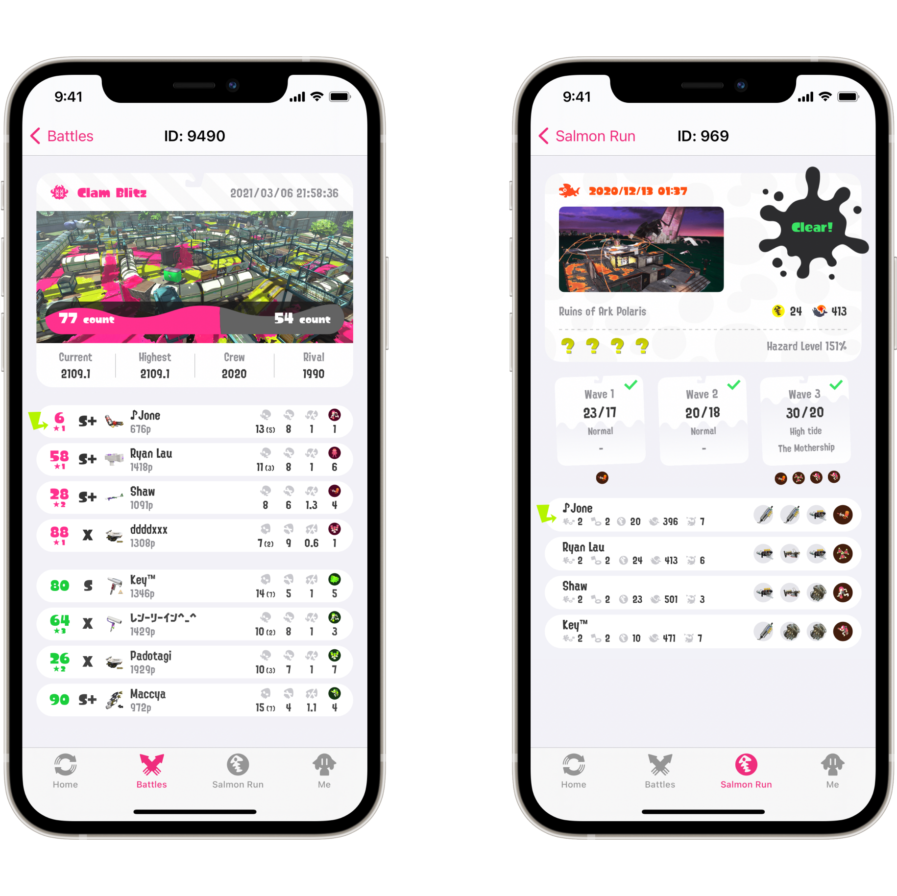
Key information can be reached instantly without scrolling regardless of game modes
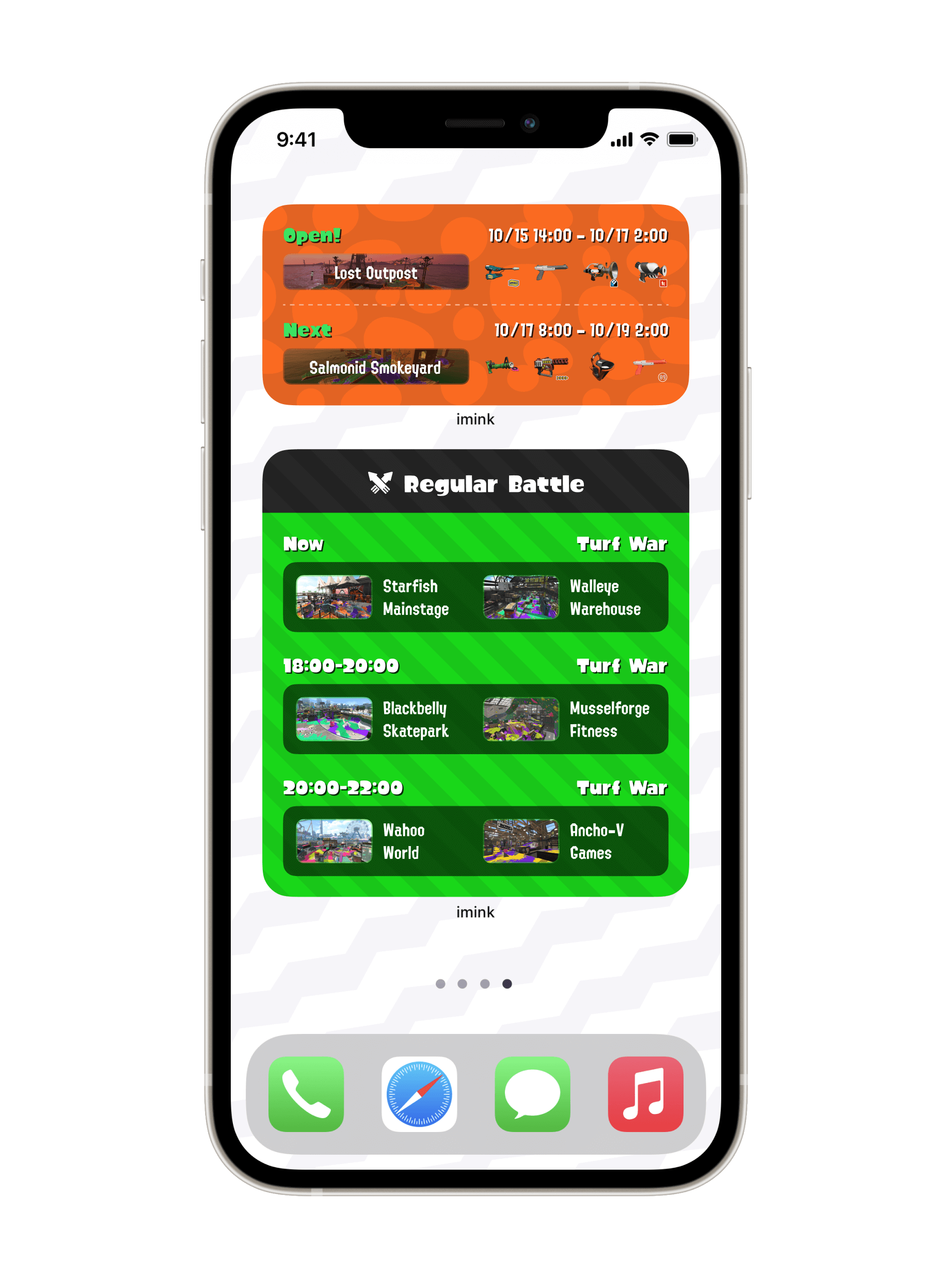
Home Screen Widgets
Bridging the squid universe with reality
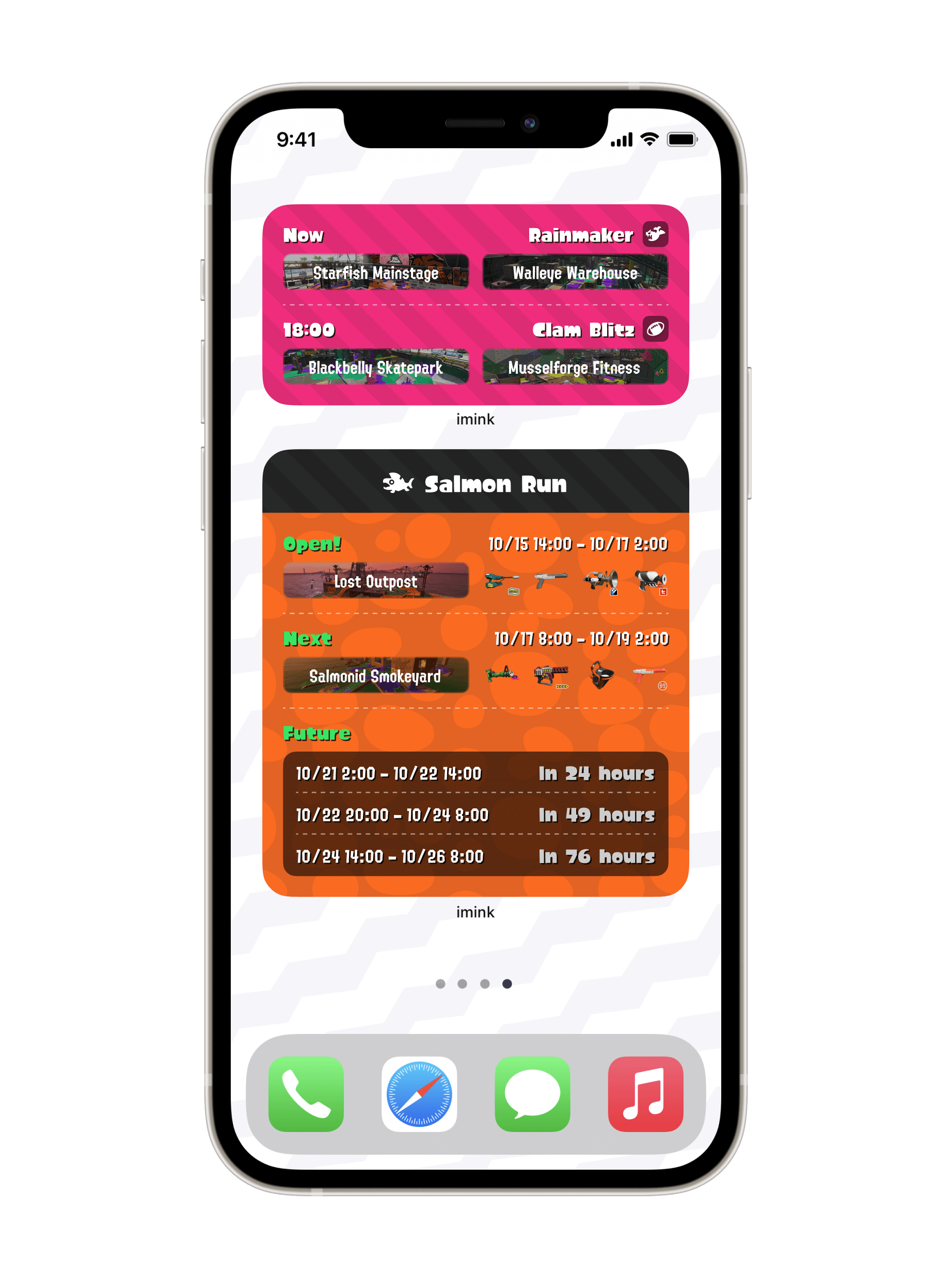
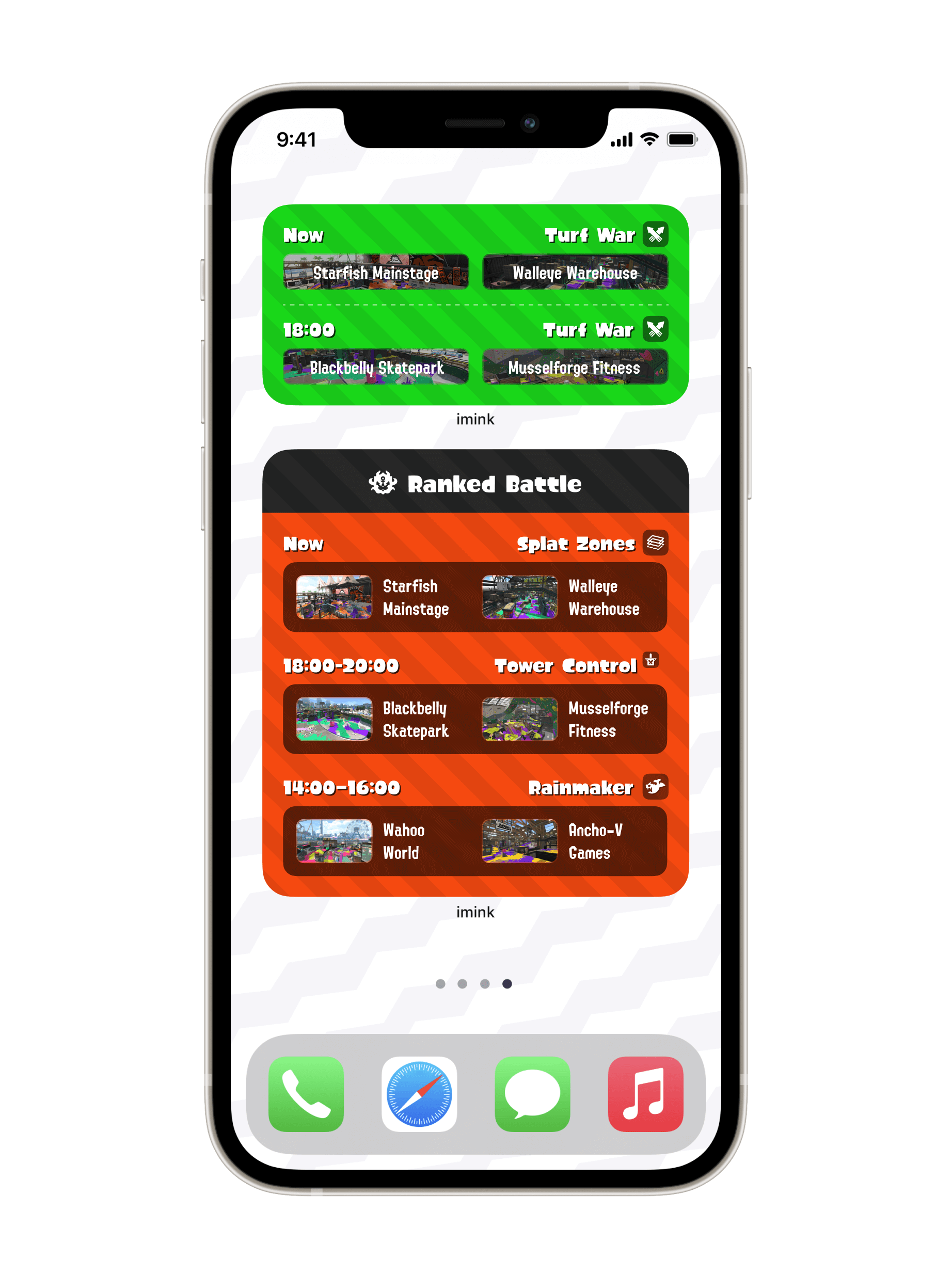
With the new Home Screen widget feature introduced in iOS 14, players can check up-to-date info from imink at a glance—no app launch required.
Unlike the core app’s adoption of iOS’s native design, the widgets embrace the franchise’s original aesthetic, aiming to bring a dash of the Splatoon universe onto every player’s Home Screen.
imink offers widgets in both medium and large sizes supporting all four game modes, providing users an ultra flexibility and versatility.
Themed App Icons
An extra touch of personality
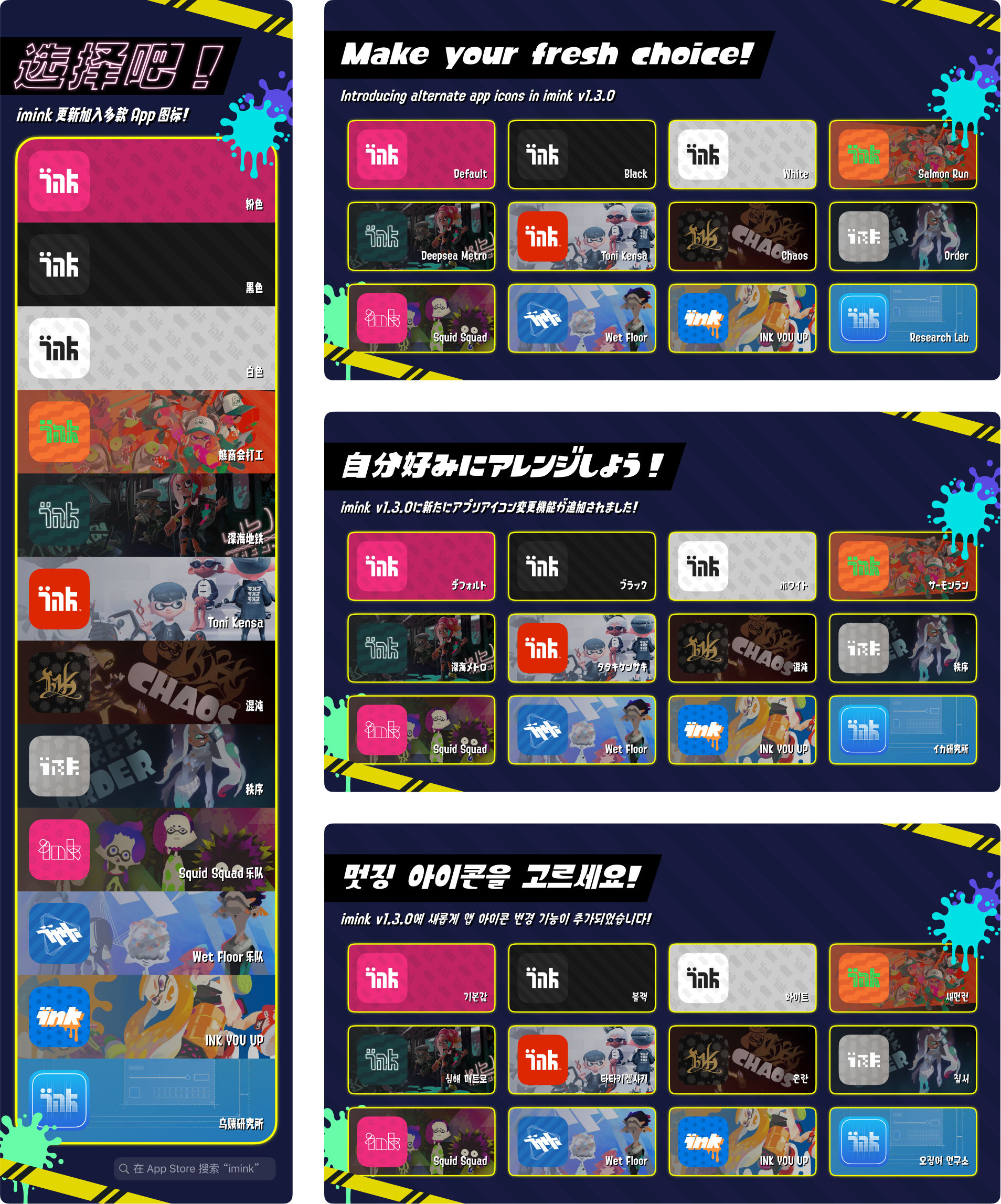
After the initial public release, we periodically released 16 app icons that correspond to a broad variety of themes and stories of Splatoon 2, while maintaining the signature branding of imink.
Through different choices of app icon, we hope each user could find their very sense of belonging in the Splatoon community.
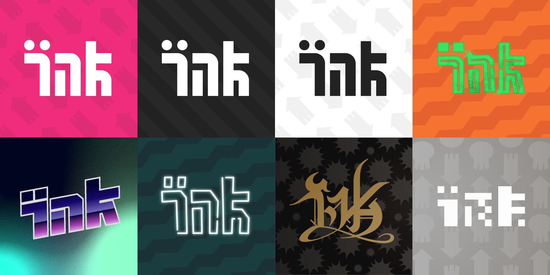
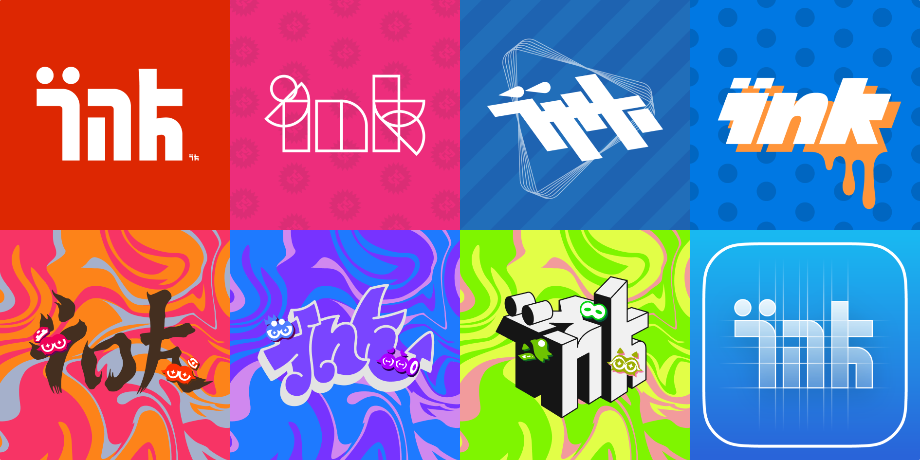
All 16 app icons at user’s own choice
Refined iconography
A more legible and cleaner look
By blending Splatoon 2’s aesthetic with iOS design principles, imink redraws all Splatoon icons and fine-tunes the contrast between icons and digits. Even icons that seem familiar were re-created in the iOS style; tiny details you might hardly notice end up being crucial to the app’s overall design consistency.
While these details might seem small—mere quality-of-life improvements—they make all the difference in transforming the experience of a game companion app.
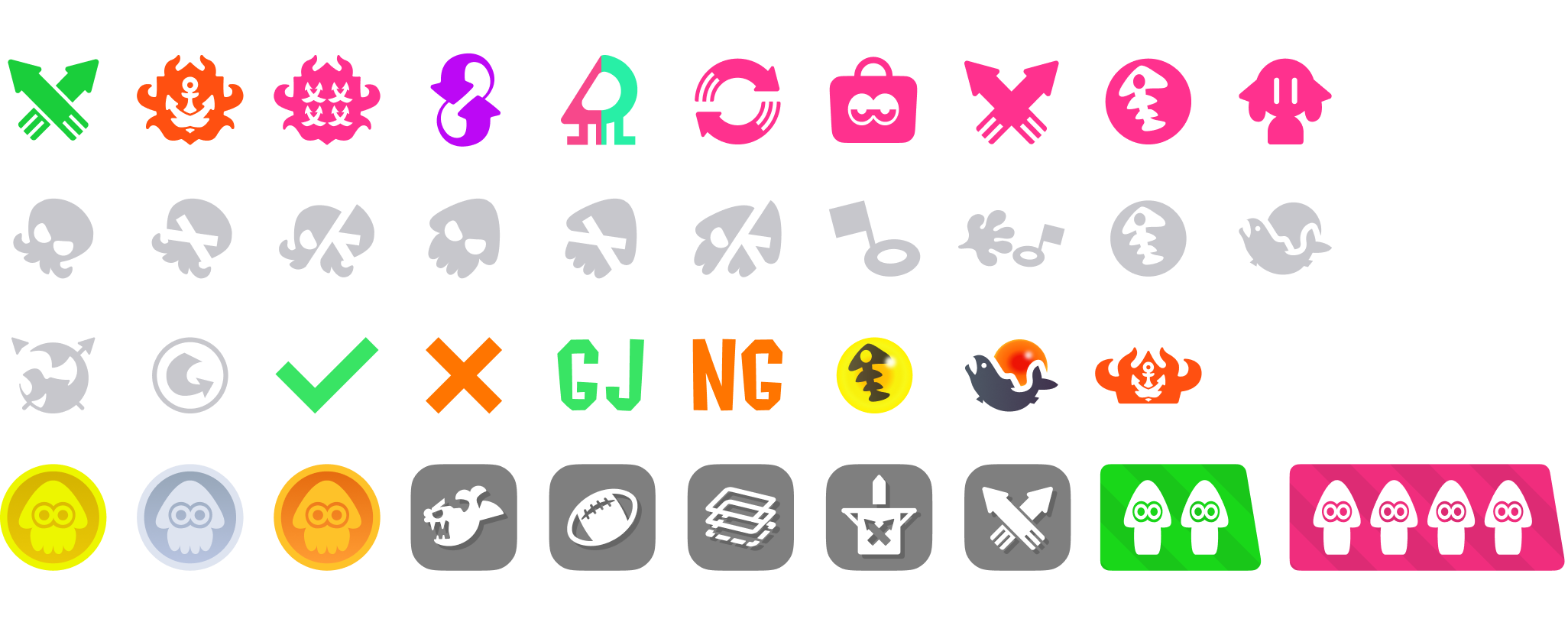
All icons redrawed in imink
Custom Chinese Typeface
Localization beyond translation
Typeface as part of identityThe Splatoon user interface uses two custom typefaces—one for large display and another for denser text. Both fonts perfectly capture the visual tone of Inkopolis, striking a balance between freshness, readability, and legibility. They also cover Japanese and English/European languages, offering a unified experience across different localized versions.
Custom typefaces on everything Splatoon—from the game itself to campaigns and franchises
Because these custom typefaces play such a central role in the franchise, we believed it was essential to maintain the same typographic approach for Chinese localization, preserving Splatoon’s distinctive “fresh” worldview. However, after searching through available Chinese typefaces on the market, we found none that evoked a true “Splatfont” feel. Our solution? Make our own.
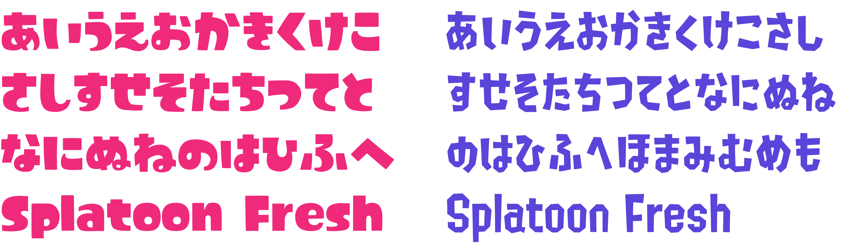
Two custom “Splatfonts” designed for display and text
Making a Chinese font? Why notOver the course of six months, we created more than 260 Chinese characters—enough to fully support both Simplified and Traditional Chinese for Splatoon 2 rules and map names.
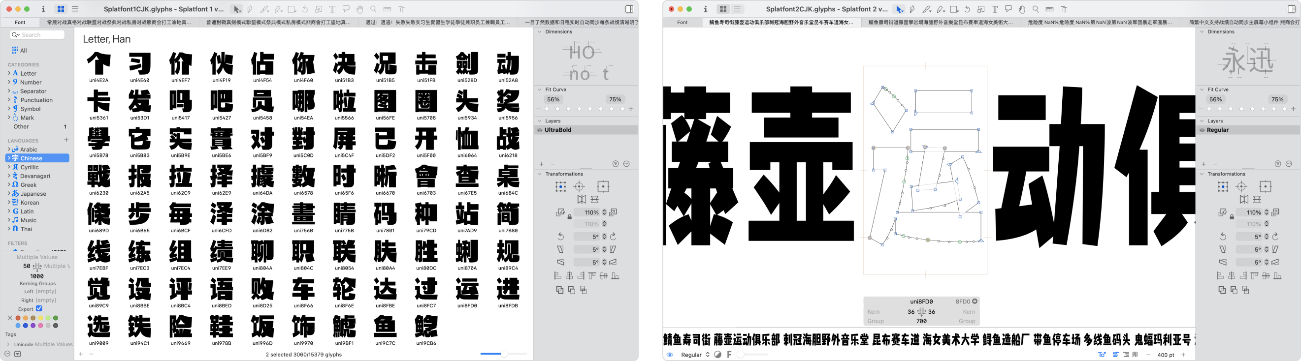
Screenshots of the font creation process in Glyphs.app
Each new character was based on the original Japanese kanji design, carrying over the same key stylistic features so that the overall font family remains cohesive. While Chinese and Japanese share many characters, there are also regional differences, so we adjusted some existing glyphs to ensure Chinese-speaking players would feel right at home. By putting this much care into typography, we’re able to preserve the unified visual identity of Splatoon for every audience—truly going beyond translation.

Regional variations of the same character
Global Localization
For that every user feels at home
Although our core team members are based in China, we’ve always upheld a global vision—from day one, we never intended for imink to be merely a Chinese app.
To ensure our localizations truly matched the language habits of native-speaking gamers, we collaborated with experienced players in each region. Using the Crowdin platform for centralized management, we made sure no language got left behind.
I took on recruitment, communication, coordination, and QA—plus, as a designer, I had to keep tabs on text lengths so every bit of localized copy fit snugly in the UI.
App Store featured images in all 6 supported languages
Post-release updates
Marketing campaigns on social media
For major updates and special events, we created promotional content in Splatoon’s signature design style, helping users feel immersed in a vibrant and authentic community.
On platforms like Weibo and Twitter, we produced social media assets in multiple languages, tailoring our approach to each audience.
Language is not the only factor put into consideration, the viewing habits on each platform also plays a part as images in portrait are preferred on Weibo, while landscape ones are more popular on Twitter.
Notably, our presence on Japanese Twitter came close to matching that of ikaWidget 2—another third-party app that had already been around for five years.
Regional variations of social media assets
Multi-platform
imink on your iPad, too.
Because we’ve put responsive design in the core of our philosophy from the very beginning, imink supports iPad natively as we took full potential of the capabilities of iPadOS to make imink even powerful and handy for users of different needs. The responsive design allows user to use imink on any window size, even along with other apps at the same time.
Open-source and beyond
A broader promise for the community
imink is our heartfelt tribute to the Splatoon community—a way for us to give back to every fan of the game. Beyond our promise to players, we’ve chosen to open-source imink on GitHub, setting a precedent for transparency and security as a third-party app.
We’ve also made part of imink’s network services freely available through authorized API endpoints, encouraging more people to participate in building innovative tools and experiences for the Splatoon community.