REDnote Global Website
In 2021, while China’s leading social network, 小红书 REDnote, embarked on its first major push to expand overseas, this site was created as a portal to introduce REDnote’s mission to “Inspire Lives”, as well as its community culture and background, and to highlight opportunities for creators and businesses. Beyond that, a newsroom was essential to stay connected with creators, media, and investors.
As the UX design lead—and the sole designer—throughout this overhaul, I was appointed for my multidisciplinary and multilingual background. From the very start, I took the initiative to steer the creative, design, prototype, and development processes, as well as worked closely with the PR team to refine the copywriting.
The site, which we delivered with pride, proved successful in both design and international impact, showcasing REDnote’s community and culture—elements that have kept the platform thriving over the years.
Background
Act local, reach global
Over the past decade, REDnote has grown into one of China’s leading social networks, shaping contemporary culture and fostering a dynamic community.
While deeply rooted in China, our influence has expanded globally, driven by the global Chinese-speaking community and a growing number of international creators and businesses looking to engage with the Chinese market. As interest in REDnote’s ecosystem grew beyond our home country, the need for a dedicated portal became evident.
To meet this need, we set out to create an global website that would not merely translate content but present REDnote’s mission, community, and business potential in a way that truly resonates with a global audience.

Founded in 2013, REDnote has grown into a vibrant community of everything
Global Site 1.0
Analysing the issues
This was not the first time REDnote attempted to introduce itself to the world. Back in 2019, its first English website was launched, as a mirrored translation of its default Chinese counterpart. However, this release fell short of expectations as we identified several shortcomings:
- As a mere translation, the copywriting and storytelling lacked engagement
- A navigation design that did not align with the user habits of international audience
- Unclear and cluttered information structure
- A disappointing home page experience as the cover video was blurred and reduced to a background element without any meaningful information
- Poor experience on mobile devices due to lack of responsive design
- Inconsistent and outdated with the branding image of REDnote
Simply put, the initial release was not truly perceived as a global site but rather as an extension of the Chinese website. And design-wise, it was outdated and there wasn’t much of work in terms of typography and communications.
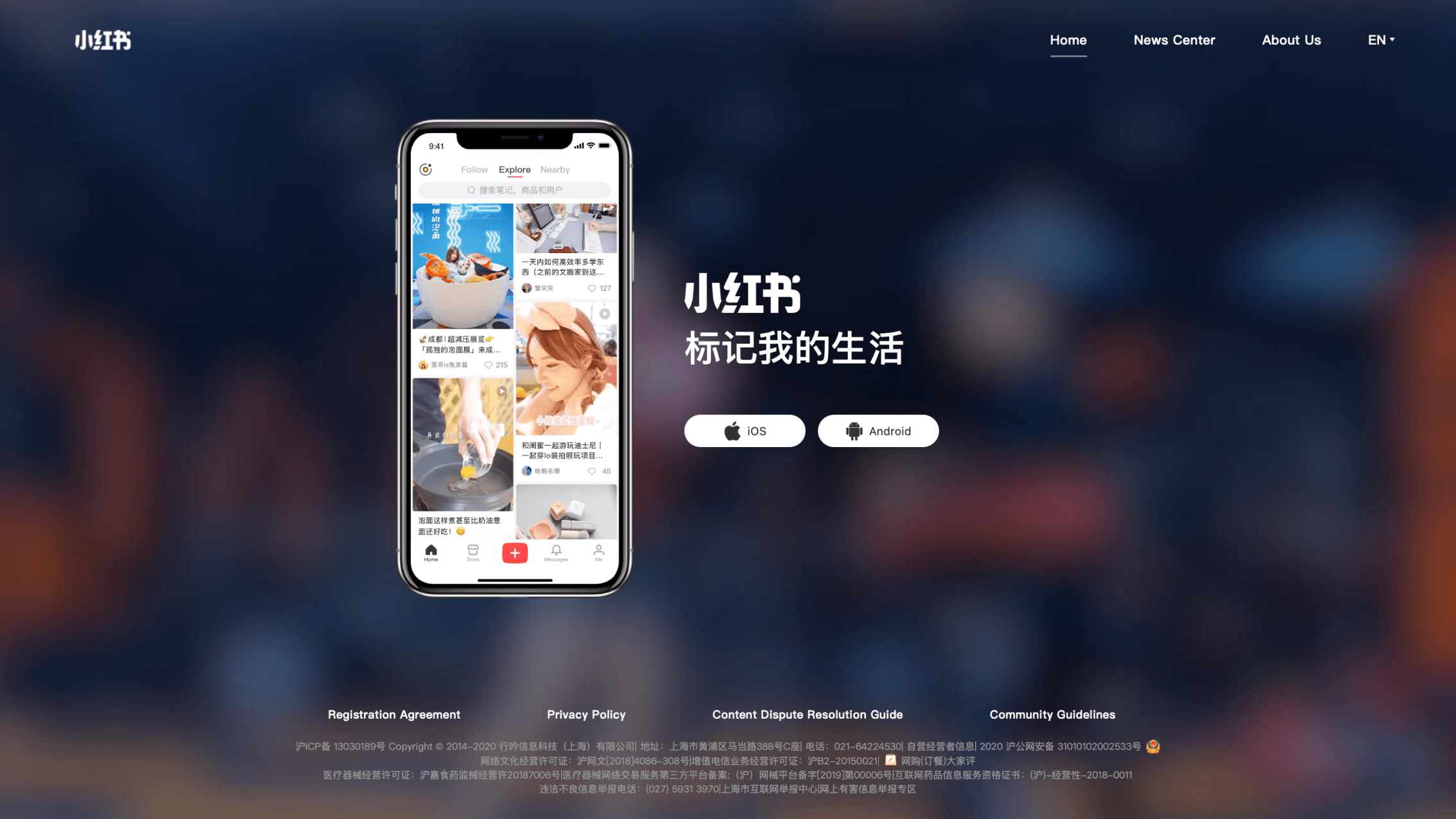
The initial version of REDnote’s English site in 2019
Workflow
Positioning my role
The team collaborating on this project was relatively compact, consisting of just one designer, one video editor, two engineers, and two PR staff members.
Given that this was a first-time overseas project experience for most team members, I took on the majority of responsibilities, extending beyond design into multiple domains, to ensure progress and oversee the entire process.
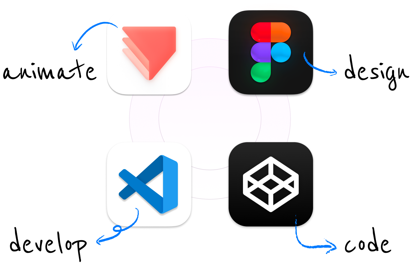
DesignI used Figma to deliver the design and ProtoPie to create animations.
DevelopmentTo ensure high-fidelity output during development, I utilized my front-end skills to deliver production-ready code and contributed directly to the development of key sections, including the homepage, navigation, and mobile optimization.
CopywritingI worked closely with the PR team to ensure the copywriting felt natural and fluent in native English.
Making an overhaul
Goals to achieve
- A standalone global site designed in English as the primary language, rather than a translated version
- A tailored focus of key topics that are targeted at the international audience
- Redesigned layout and typography that enhances efficiency and optimizes browsing experience
- Responsive design that feels native on any screen size or device
- Clean, elegant, and dynamic design language that celebrates REDnote’s image and style
- A comprehensive design system that enables flexible content management and updates
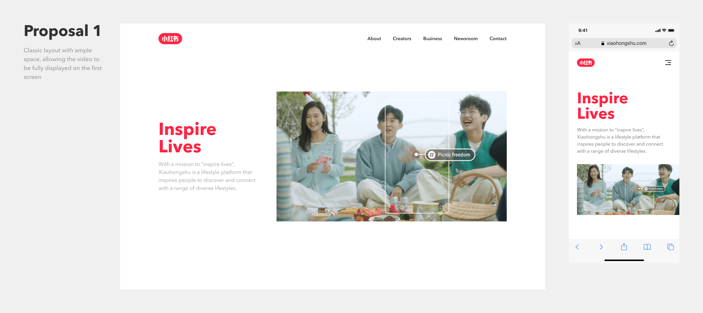
First screen design
Defining the first impression
The first challenge was to design a homepage that immediately captured attention while effectively communicating the core message of our community. With only a slogan, a short paragraph, and a cover video to work with, I had to make every element count.
Since I embraced responsive design from the very start, it was equally crucial to ensure that the experience remained visually striking on mobile devices.
Through brainstorming and experimenting with various graphic layouts—from classic to modern—I developed several proposals for further discussion. While each design was visually appealing, they all felt somewhat static, lacking the sense of dynamism we had envisioned.
That led me to a crucial question: Since we were working with web technologies, what if we infused interactivity into the design to bring the visuals to life?
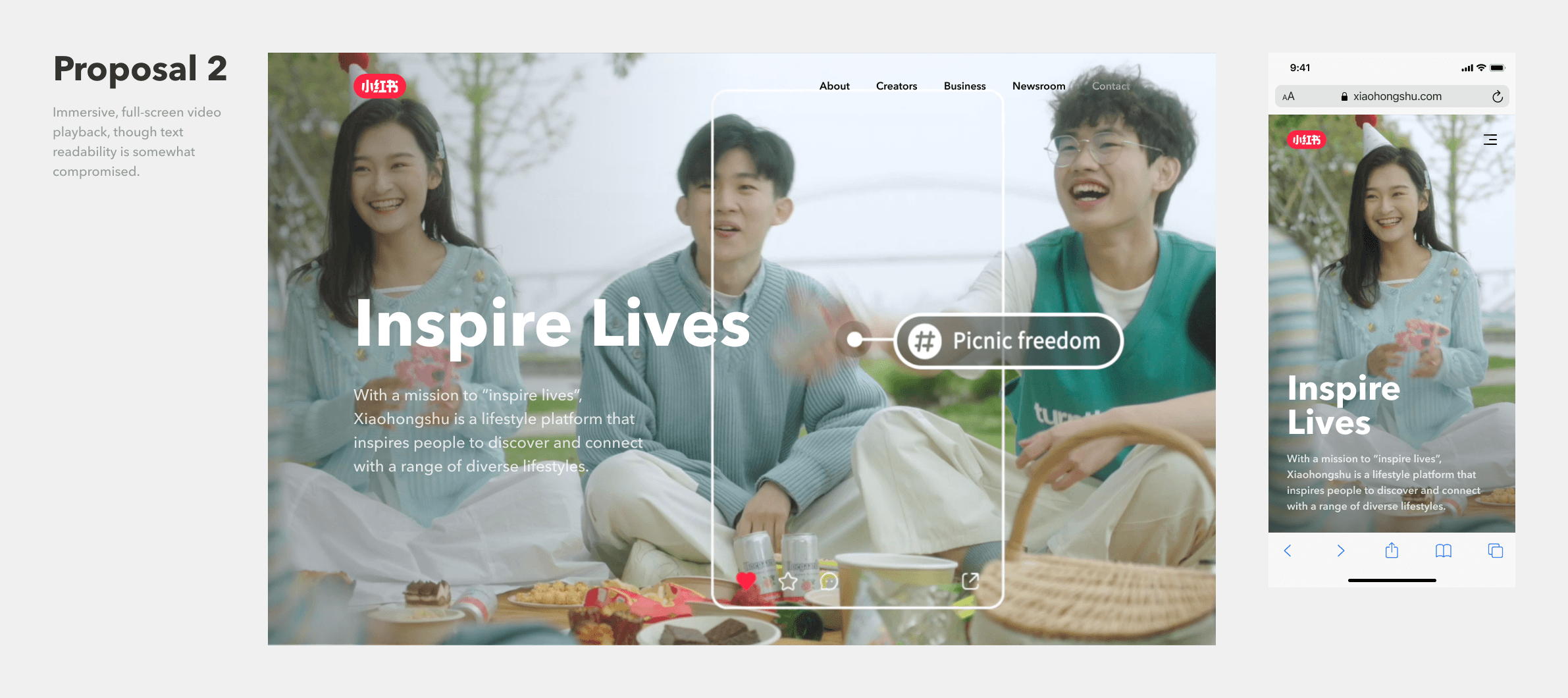
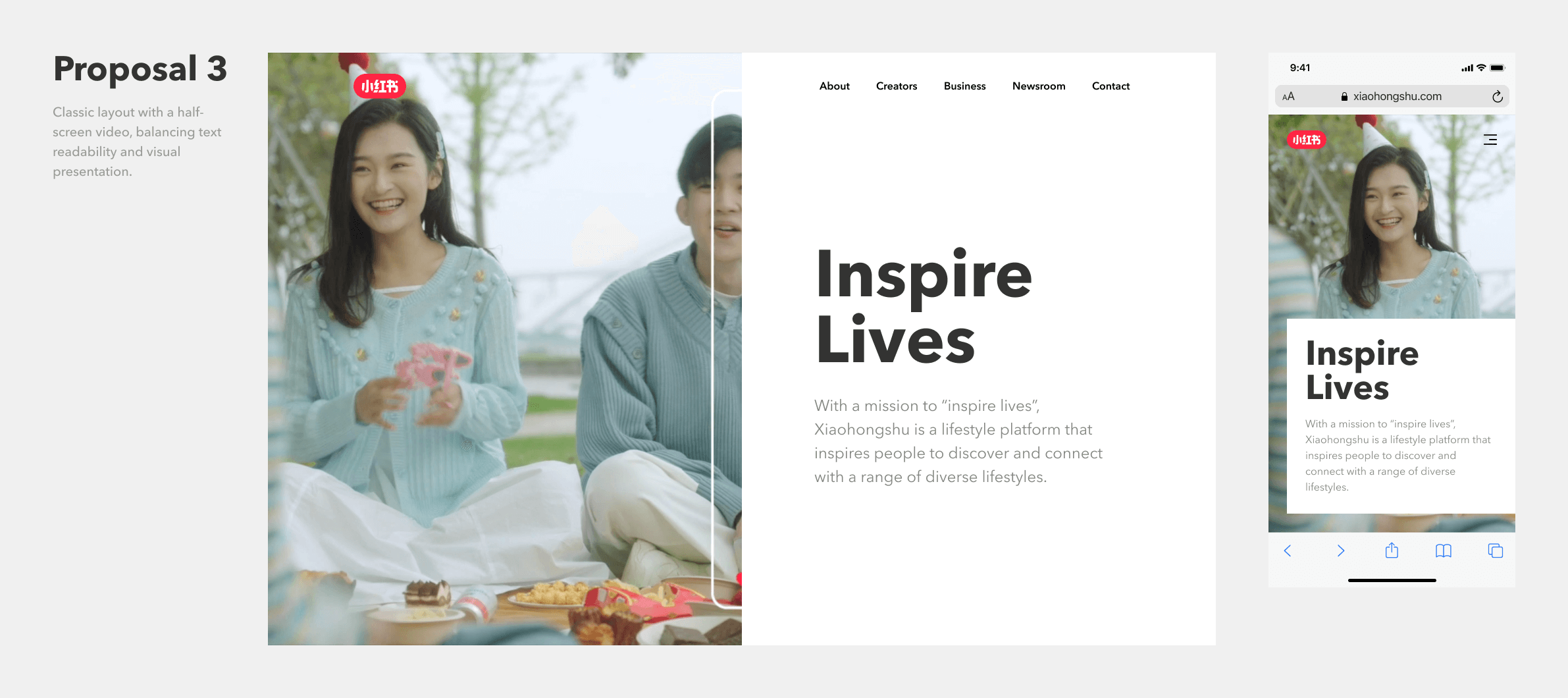
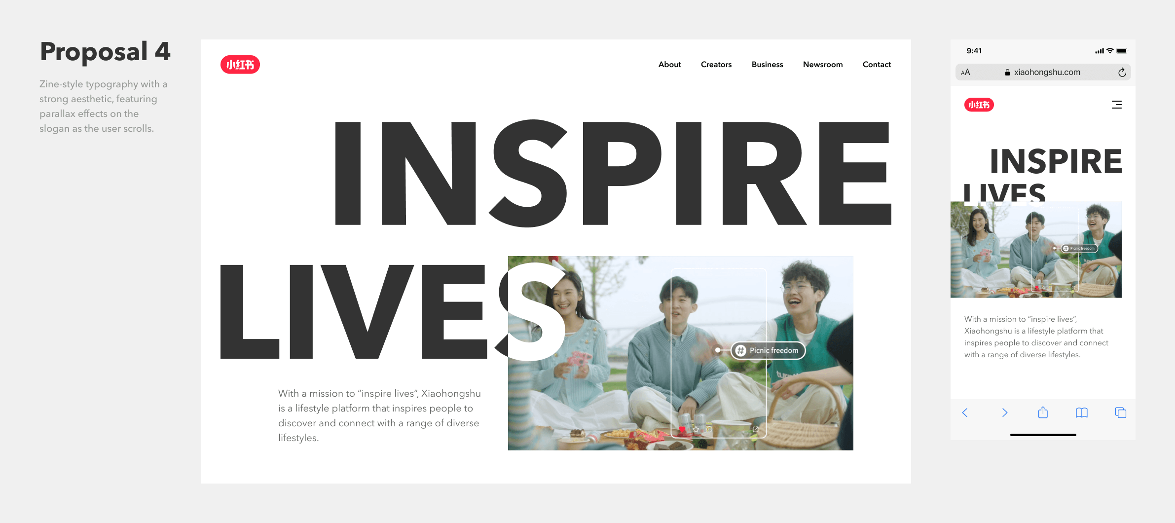
Initial proposals that did not make the final cut
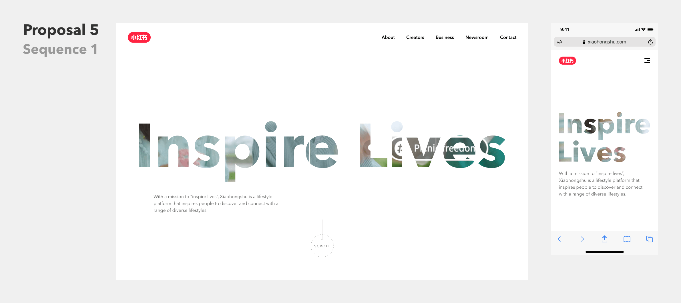
Since scrolling played a core role in the web experience, I explored ways to gradually reveal our message through user interactions, adding an element of delight and surprise of exploration to the process.
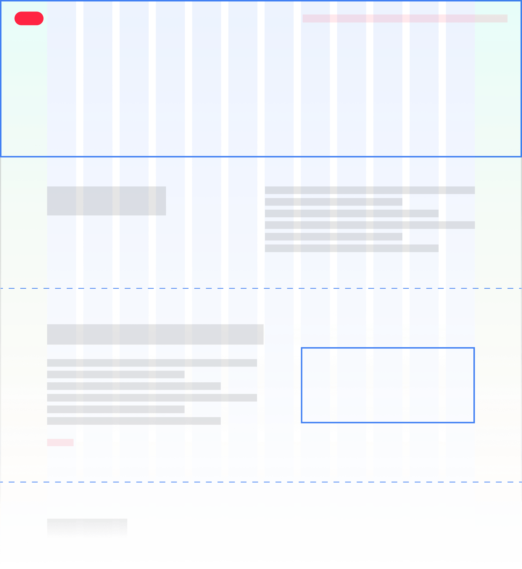
This led to my final proposal: the “Inspire Lives” slogan would act as a shaped window, offering a glimpse into the vibrant lifestyles that REDnote celebrates. As the user scrolls further, the video gradually unveils itself, expanding to full screen—an immersive moment when a whole new world, that you could explore with REDnote, is right in front of your eyes.
Instead of simply delivering the message from our perspective, this design puts users at the center of the experience—as a platform that inspires lives, we empower people to lead their own journey of exploration, discovering and engaging in their own way.
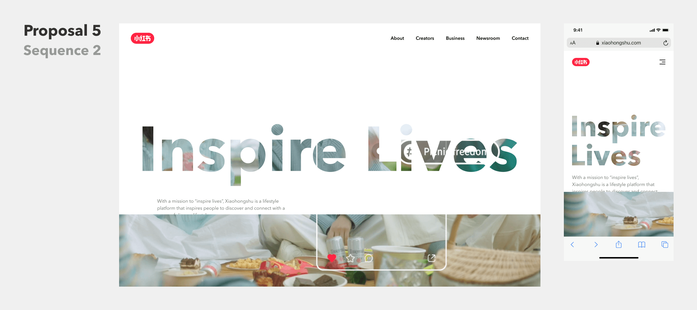
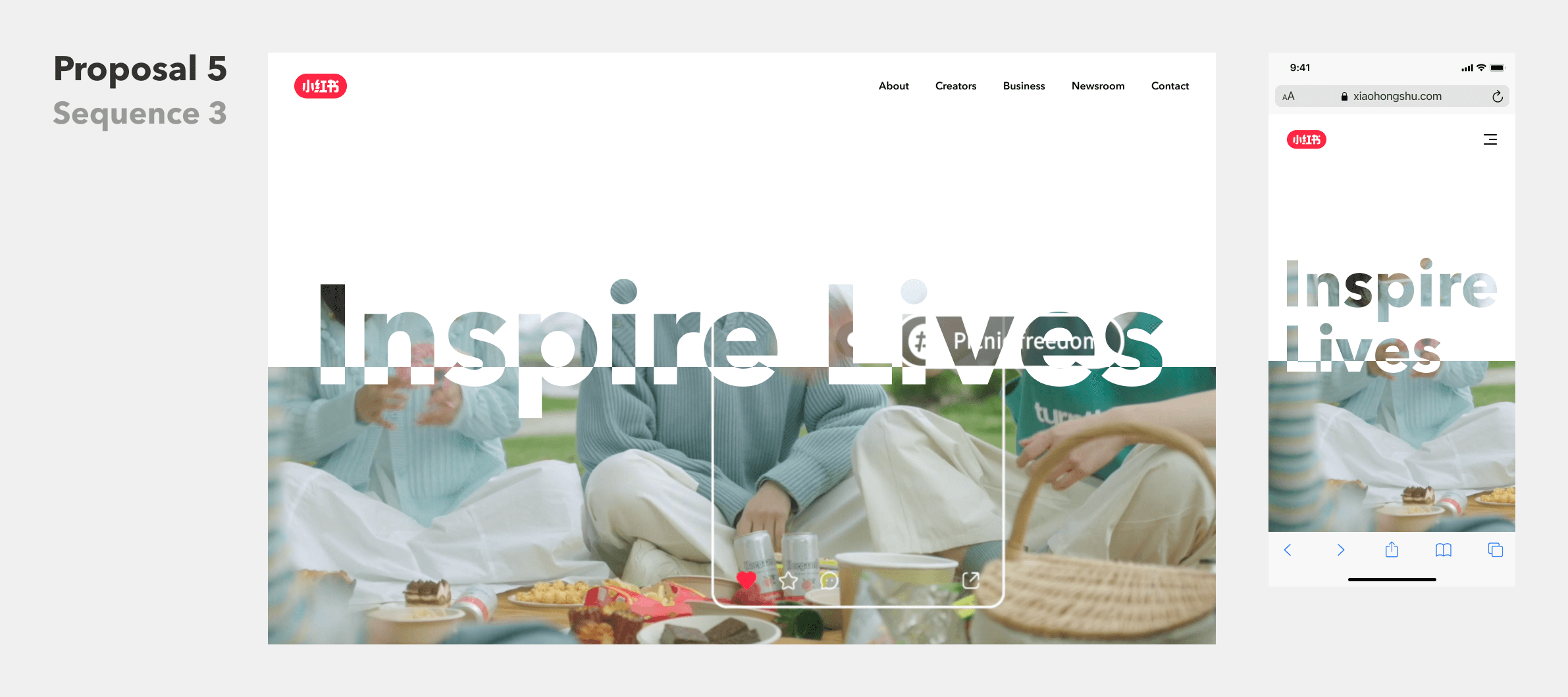
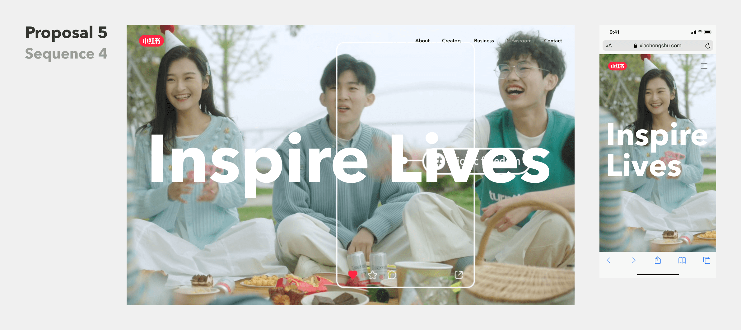
The original storyboard of the adopted proposal
To implement the design without compromises, I created an interactive demo of the homepage with fully production-ready code, which not only ensured a smoother design handoff but also accelerated development.
Feel free to explore the interactive demo below by simply scrolling down the page.
 Scroll to get a closer look at the first-screen experience
Base layout system
It all started with the grid
The foundation of our design lies in the grid system, which not only structures and positions content but also ensures visual consistency while maintaining flexibility across all screen sizes. It establishes a cohesive aesthetic, enhancing readability and adaptability without sacrificing individuality in page layouts.
Our grid system, built with Flexbox, follows a 12-column structure that dynamically adjusts as the screen size changes. On smaller screens, it seamlessly transforms into a 4-column system, ensuring an optimal viewing experience across devices.
By maintaining a clear visual hierarchy, every page aligns with the same foundational structure while allowing content to define its unique character.
Subpage design
Narrating our story the RED way
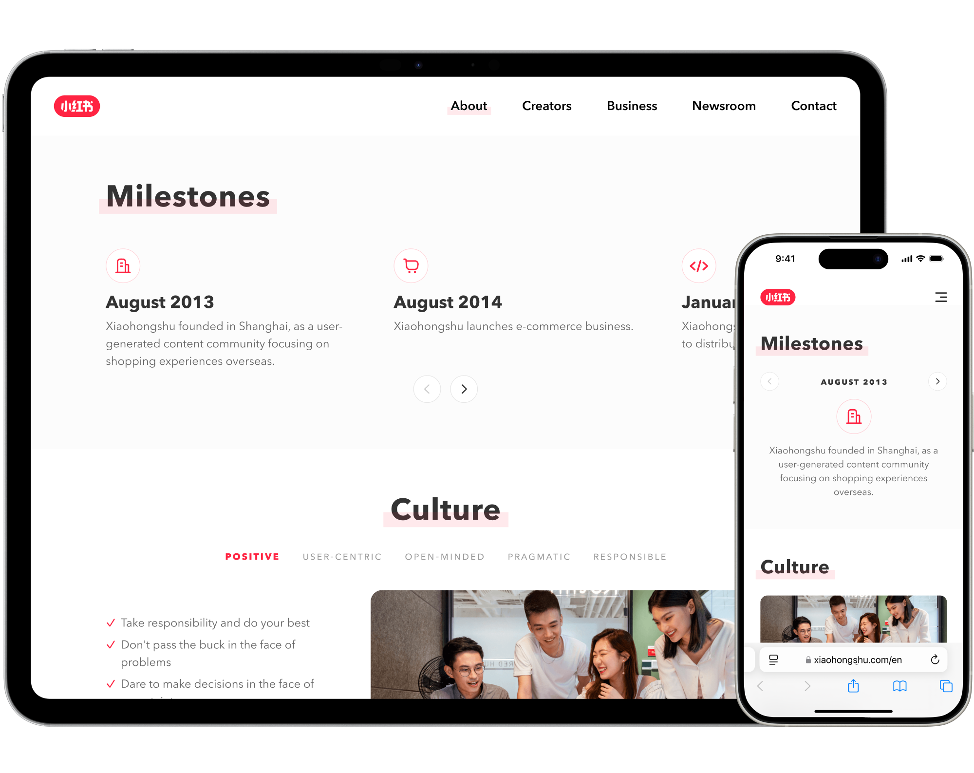
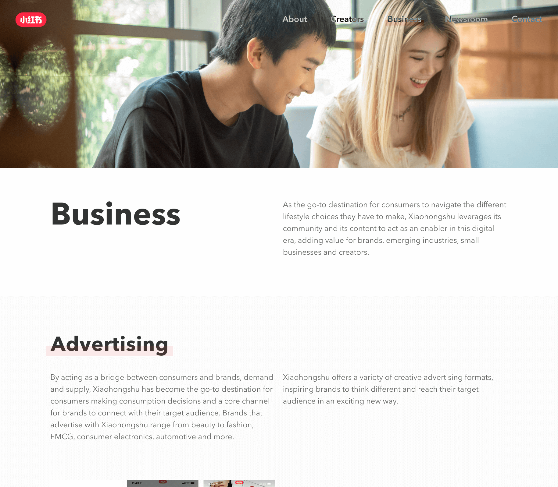
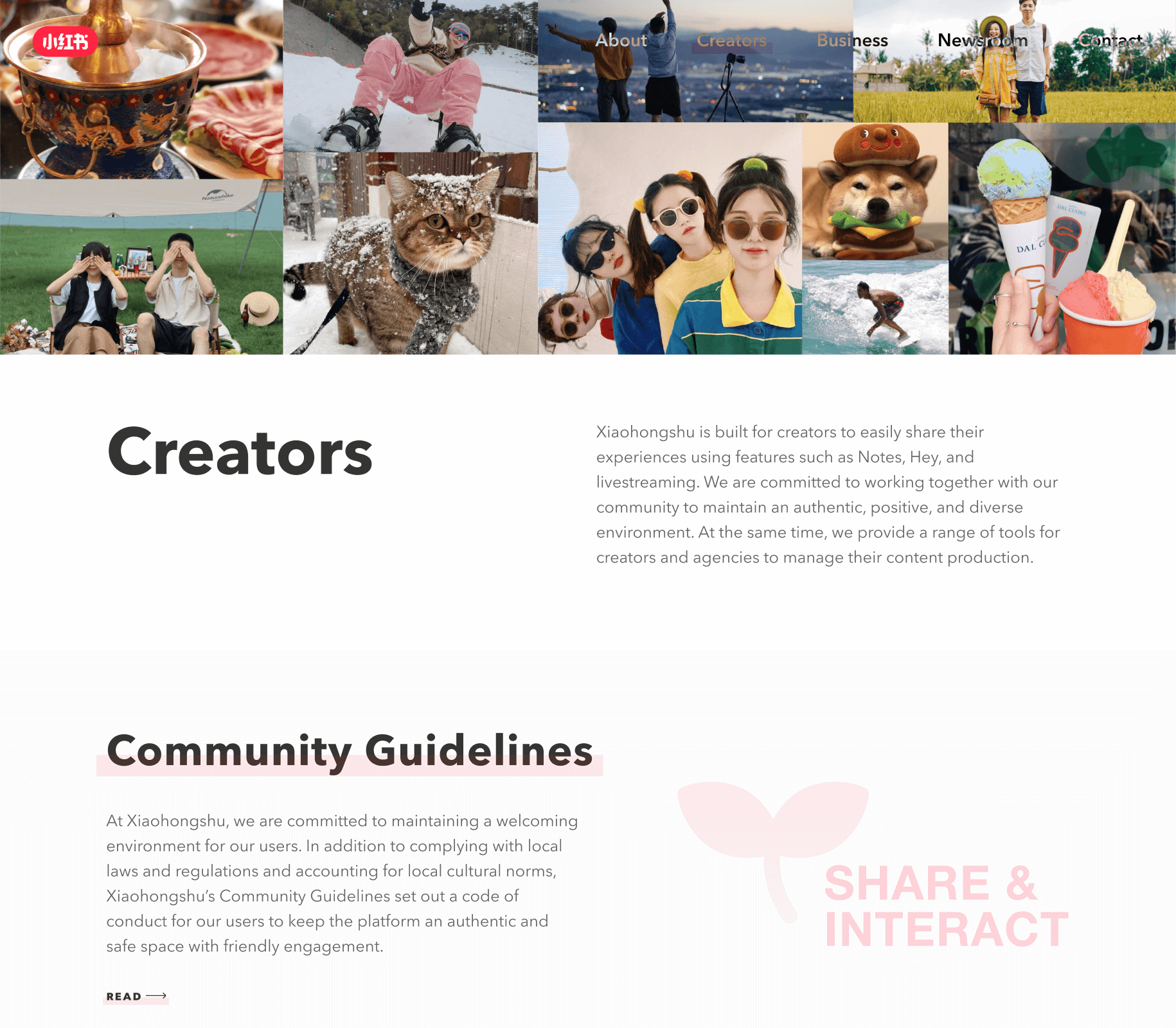
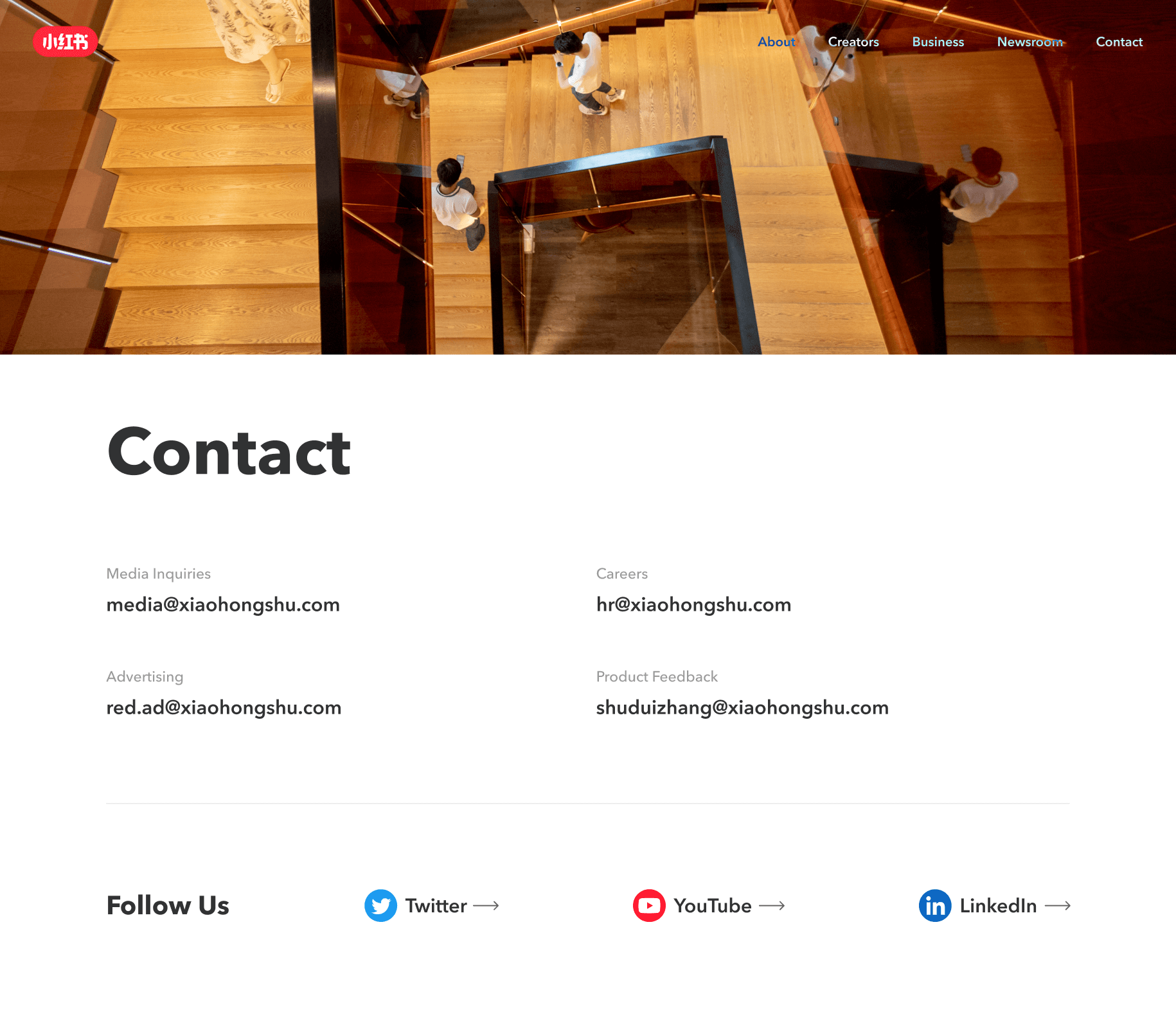
To simplify the learning curve for understanding REDnote, we introduced four dedicated subpages: Creators, Business, Newsroom, and Contact, each telling a part of our story.
By blending a tone familiar to international audiences with our unique style of narration, we crafted an experience that stands apart from any of our previous Chinese-language sites.

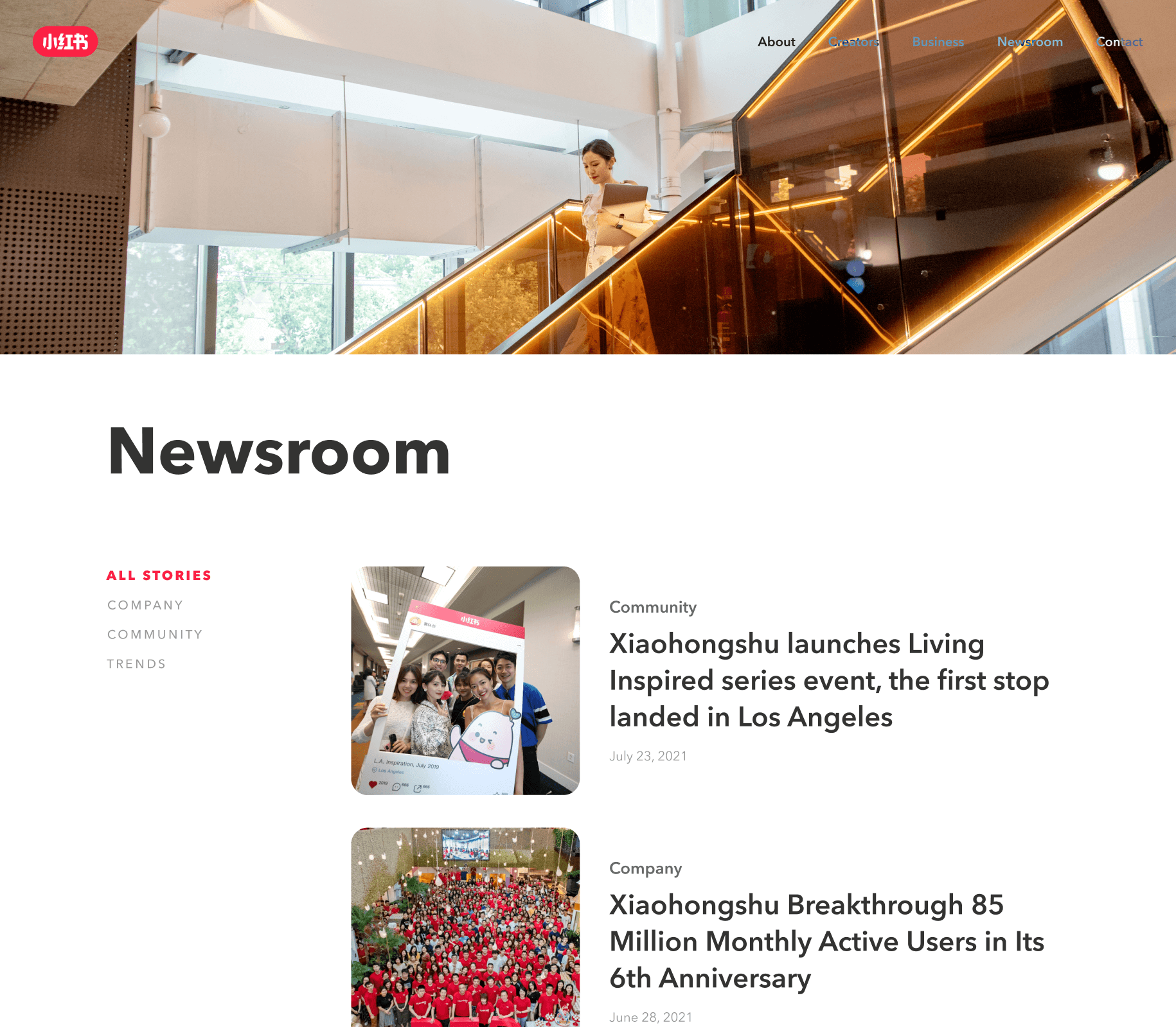
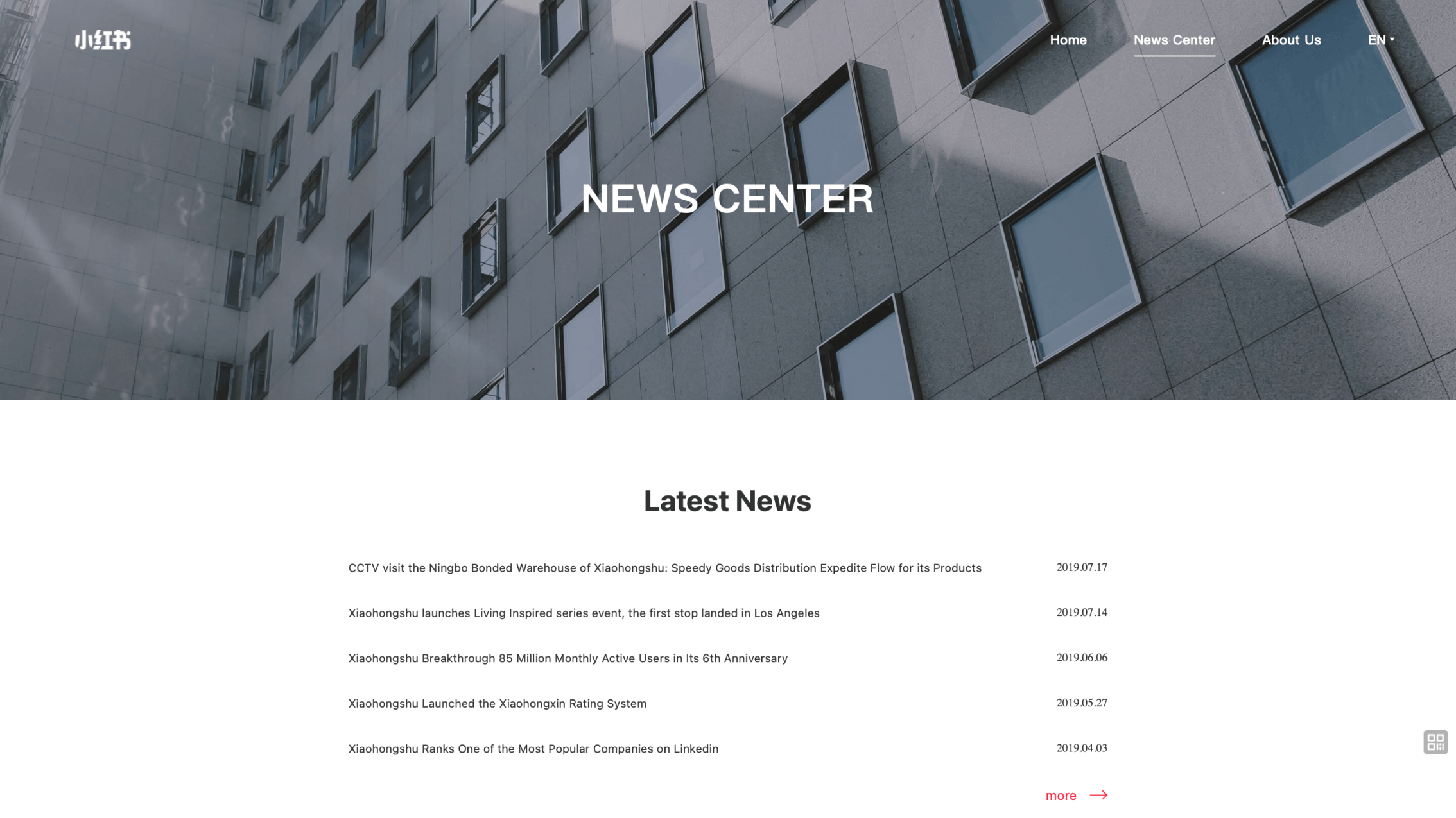
Newsroom
A unified tone by design
As the most frequently visited section of the site, the newsroom holds a special place, serving as REDnote’s voice to the world while supporting long-term updates.
To ensure a unified tone and optimal readability, we developed a comprehensive styling toolkit that blends state-of-the-art typographic practices with REDnote’s distinctive brand identity.
Since news articles are routinely updated by the PR department, the toolkit is designed to provide a code-free publishing experience, allowing effortless content management while maintaining a polished and cohesive visual presentation.
To view all styling elements supported by the newsroom, simply scroll down the sample article below.


Scroll the sample article to view all styling elements
Interactivity
Dynamic and playful
Interactivity has always been at the heart of our design. Rather than stopping at static visuals in Figma, we embraced micro-interactions—such as web animations, transitions, and hover effects—as an essential part of the web experience.
For most of these micro-interactions, I designed directly in code. With production-ready snippets on CodePen, the hand-off between design and development had never been smoother.
On the demo device displayed to the right, by simply hovering over menu items or toggling the menu button in the top-right corner, you can get a glimpse of the delightful interactions we’ve crafted throughout the site.
On the demo device displayed below, by simply hovering over menu items or toggling the menu button in the top-right corner, you can get a glimpse of the delightful interactions we’ve crafted throughout the site.
For more micro-interactions I created, a CodePen demo is available via the link below.
For more micro-interactions I created, a CodePen demo is available via the link below.
Full responsive design
On any screen, without any compromise
As responsive design has become an industry standard in web design, we embraced the philosophy from the very beginning of the process. From the flexible grid system to dynamic components and mobile-exclusive layouts, we ensured a seamless and uncompromising experience—no matter what device you’re on.